Increasing conversions for Personal Styling service
Duration: 4 Weeks, September-October
Role: UX/UI Researcher and Designer
Key Skills: Interviews, Personas, User Stories, Sitemaps, User Flows, Wireframing, Prototyping, User Testing, Visual Design
Eco-Stylist is the go-to resource for stylish and ethical clothes. At Eco-Stylist looking good and shopping by your values are mutually inclusive. They offer a directory of certified sustainable brands, a stylish marketplace for sustainably made clothes, and for customers who want to level up their personal style, a virtual personal styling service.
Problem Statement
The Personal Styling page is not converting as many users as the company would like even as they drive more traffic to the page.
The Solution
Greatly improve the Personal Styling user flow by redesigning and reorganizing the associated pages leading to an increase in user conversions.
For this project, I worked alongside two other UX team members who were also part of the Springboard Bootcamp. We shared responsibilities and deliverables and met with the founder of Eco-Stylist, Garik, weekly to give updates throughout the process.
Creating a plan and reviewing previous data
Previous design audits had already been completed on the overall site resulting in a redesign and content update. We took some time to review this data before our initial meeting with Garik. Previous user testing and information gathering of the website focused on the homepage, brand ratings, and blog sections of the site. Some insights from this review included:
- Previous user testing showed that most users were confused about what Eco-Stylist offered
- The most popular parts of the site were the Brand Style Guide and Blog
- A slim number of users visited the styling page and when asked none placed it high on the list of their favorite parts of the site
- Creating a clear path for users was at the core of the recent redesign
A quick look at the site analytics showed that users on average spent under two minutes on the styling page with almost half exiting the site after.
We decided that doing user testing of the current styling flow would provide us with a strong base for our redesign and help us get a better understanding of potential user thought processes. Initially, a plan was made to create a survey that would be shared on Eco-Stylist social media which would provide us with some general information and help us recruit potential interviewees. This survey was created and shared with Garik but he decided instead to reach out via email to a few specific users.
During this recruitment process, a heuristic analysis was done of three styling competitors given to us by Garik. These sites included Cassandra Dittmer, Deni Kiro, and Next Level Wardrobe. Each of us reviewed a site coming back together to form a list of key takeaways that could inform improvements to Eco-Stylist’s flow. These takeaways included:
- A focus on the main stylist and their mission, style, and ideas with information on who the stylist is
- Information that is presented in an exciting and cohesive way that details all aspects of the process
- Clear call to actions that give users a pathway to follow while moving through the site
Building a new user flow based on interviews and testing
Interviews were set up with five potential users and one user who had previously used the Eco-Stylist styling service. They were asked questions about their feelings on personal style and if they had ever used any styling services before. The interview culminated in the user walking through the current site while answering questions about the experience.
During testing, most immediately clicked on a Get Started button near the top of the page which brought them to the scheduling form. Here they could read about the services but were frustrated by a lack of information.
“Reading through the first thing here, this idea of style analysis. I’m unsure even what I would need to bring to that first meeting. Do I need to have photos of my closet, my outfit? So what does Style Analysis mean?”
Amber
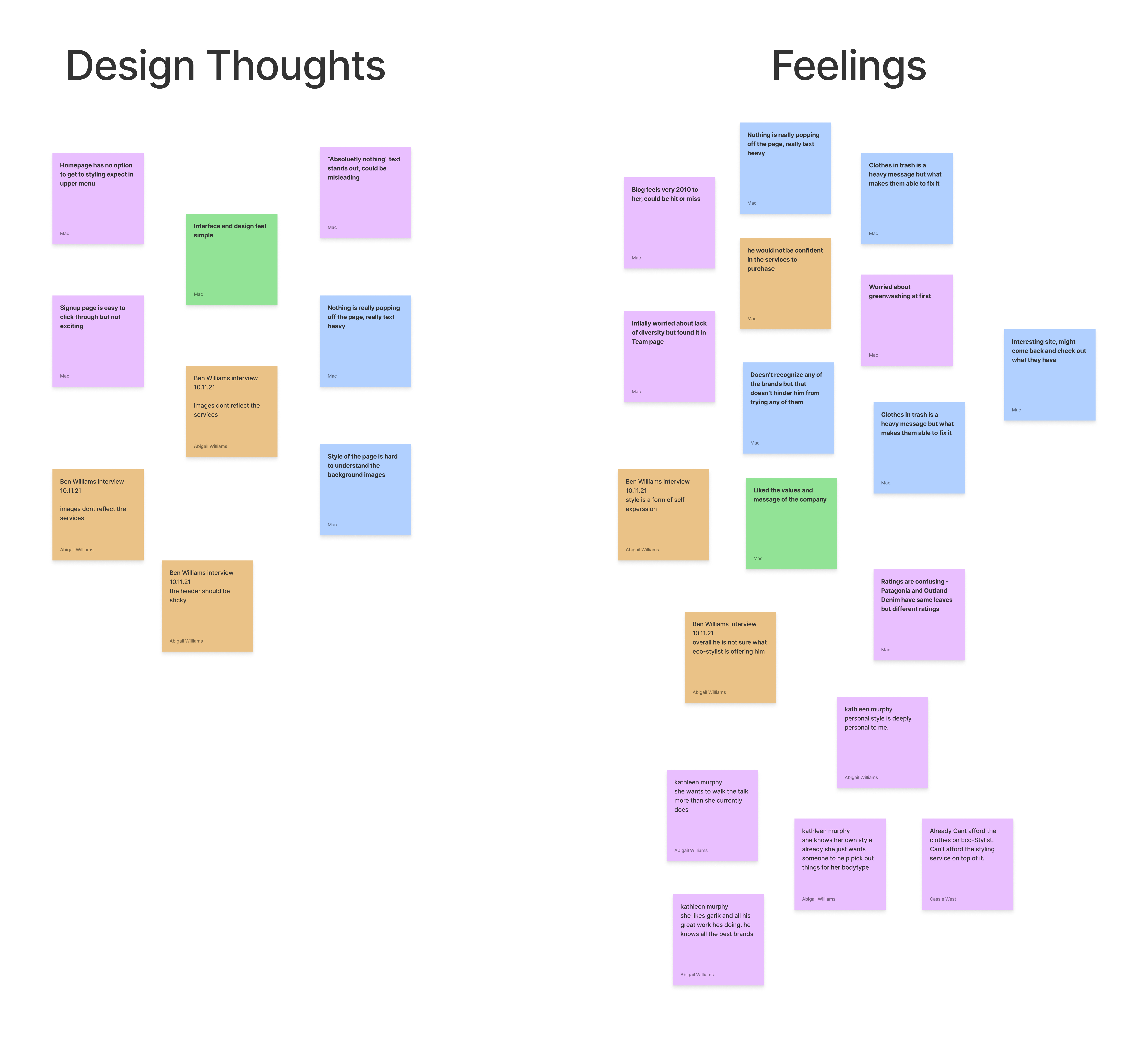
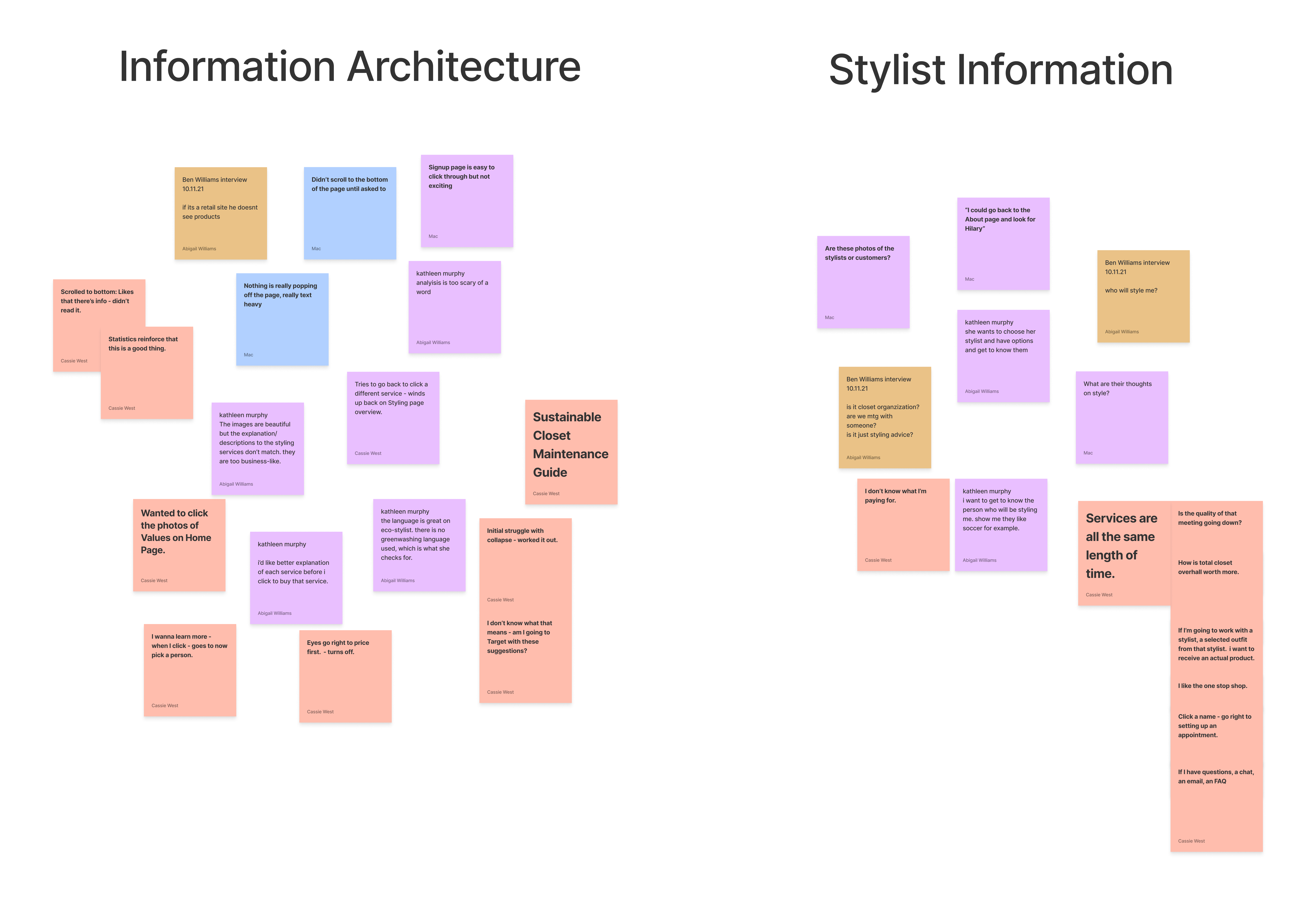
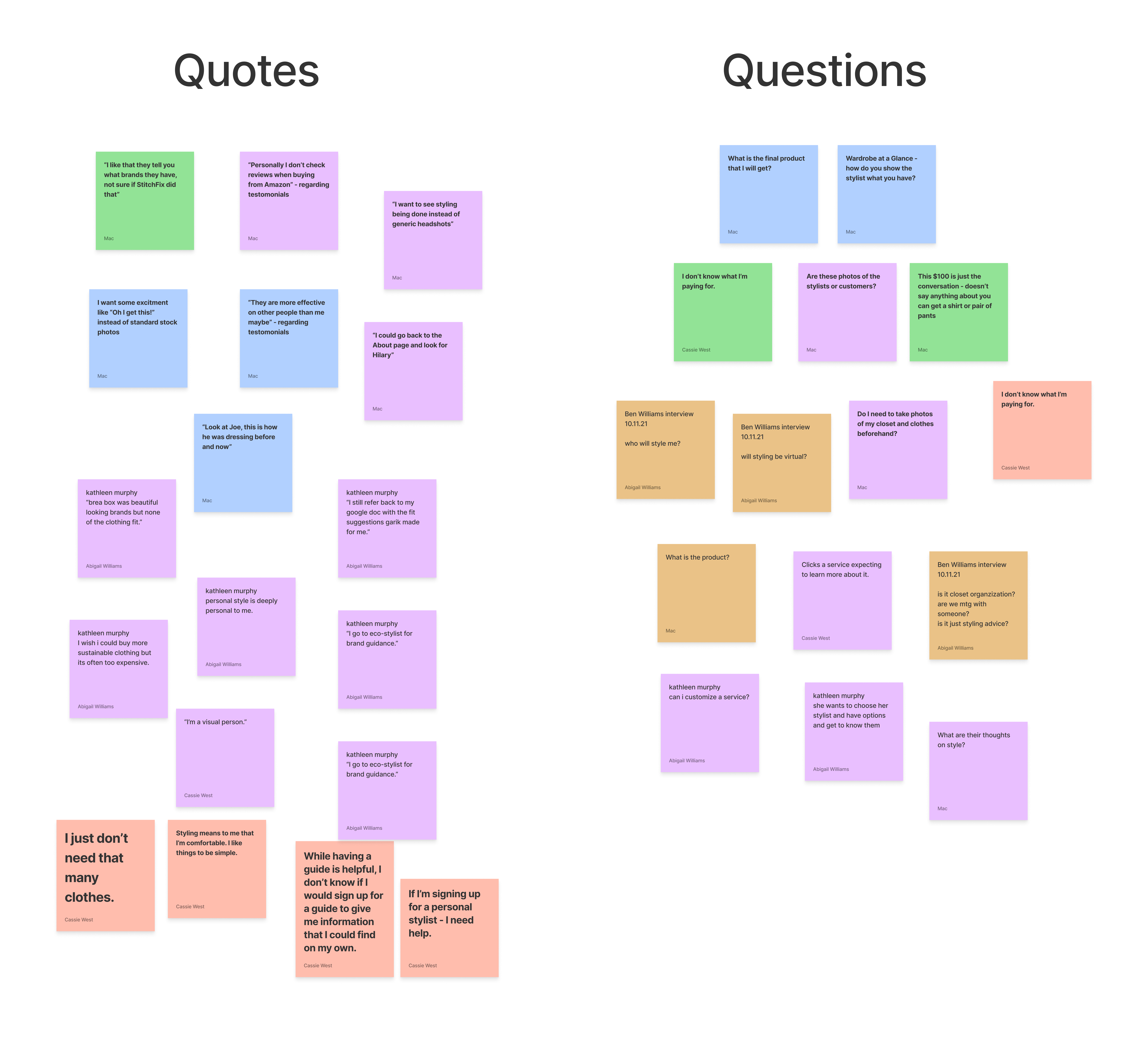
We compiled the notes into an affinity map to help pinpoint insights. It was clear that the current page design was creating distrust with users. They were unclear on what they would receive in a styling session and therefore unable to determine if it’s something they needed or if it was worth the price. Other insights were broken down into categories.
- Lack of clear messaging and information
- Many users voiced questions about service details
- Users didn’t feel confident about what the offerings were
- Confusion regarding the different service types
- Lack of excitement
- The use of stock photography was unappealing
- Walls of text caused users to scroll
- Lack of information on the stylists themselves
- Users had to go to the About page for more information
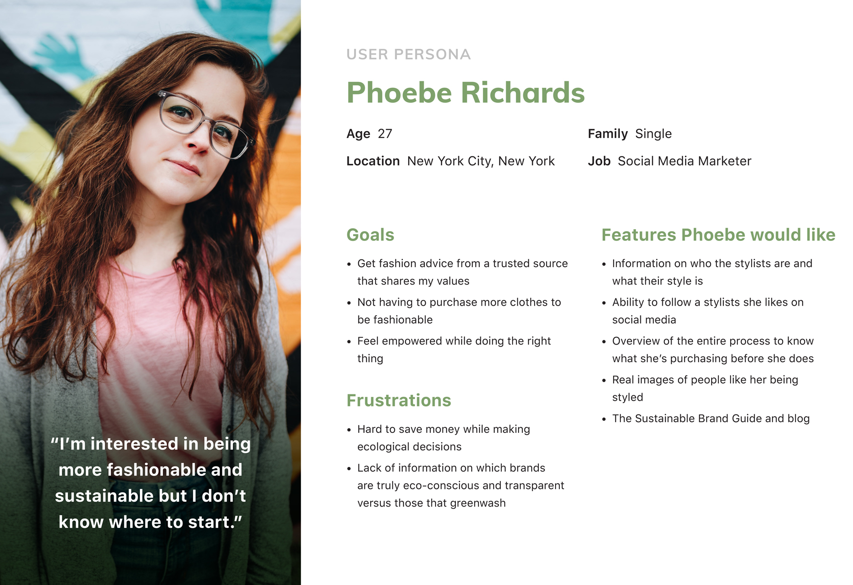
Based on all the information we gathered I created a persona to reflect a user who would interested in personal styling.
We also interviewed one of the current stylists working at Eco-Stylist to get a better understanding of the process and user opinions. She mentioned that users usually had questions at the outset and were unclear on the details of the service even after signing up.
Designing a prototype to test the new flow with potential users
With the insights from the user testing, the three of us met to ideate. We felt that an overhaul of the flow would help create a pathway of knowledge for users. The decision was also made to set up specific pages for each service and stylist to allow for clear messaging. This new flow would instruct users on the overall service and then allow them to pursue more information based on their interests. Clear call-to-actions would be present on each page to lead them to the next part of the flow.
We shared our plans with Garik to get his feedback. One page that we wanted to address in our redesign was the scheduling page however we saw that it was created using Acuity Scheduling. We weren’t sure how much redesign could be done within the bounds of the system. Because of this we instead shared some specific feedback for that page with Garik and reviewed possible edits. One specific update was to get rid of the time information which had been a point of confusion for users during scheduling.
With a solid base for the redesign, we created a low-fidelity wireframe before moving forward with a high-fidelity prototype of the new screens. These screens were designed to match the look and feel of the rest of the website. We also worked to remove all stock photography from the pages and replace it with actual photos of the stylists and past customers.
Testing was then done with a combination of new and old users. They were presented with the prototype and given the opportunity to move through the flow while sharing their thoughts and answering questions.
We made a deliberate choice to start the prototype on the Eco-Stylist home page to test users on the full pathway for styling. While they were able to get to the main styling page many were frustrated by the singular path. They felt that if the personal styling service was important enough to the company then it should be more present on the site.
Overall users were pleased with the new layout of the styling pages and felt that they were presented with a better understanding of the services. Certain aspects of the redesign like the use of icons, the FAQ, and the use of real photography made a big difference.
“I like the services being broken down. It shows you what they will cost and what exactly they provide.”
Barkin
In general, while users liked what was being presented they wanted more. Some felt that there wasn’t enough on the stylist’s page to make a choice between one or the other. A few specifically asked for more Before and After imagery. They understood what the service could provide them but weren’t yet sold on the value for them personally.
“Instead of saying what it is, tell me what it will do for me.”
Mattias
Next Steps and Recommendations
After testing we met as a team to review our notes in order to propose changes to the prototype and make recommendations to Garik for future updates.
Some minor layout changes were made to the main styling page to provide more information about the service and results before linking to the pages about the stylists. More content was added to each Stylist page including a section for specializations to help them stand out from each other. Part of our recommendations would be to expand the offered information including a longer stylist bio and more photos.
A final overview of our testing and recommendations for the website was presented to Garik, including:
Designing a prototype to test the new flow with potential users
Including more pathways to direct users to the personal styling service with continued testing of the usability of the site to help with this.
Build a repository of high-quality client & service specific photos
Photos will be used across the personal styling pages to help users see the value of the service. Consider quarterly updates of user before/after photos so that the content feels fresh.
Highlight the personal experience in personal styling
Include personal stories with before and after testimonials. Integrate this into the website blog in order to create pathways between site content. Highlight client fit satisfaction and support they received during the process.
Continued clarification of styling process
Rework parts of the written content to encompass the full experience. Update the FAQs to reflect user concerns & questions in order to answer them before the personal stylist has to.
Final Thoughts
This was my first UX project working alongside other UX team members. The ability to converse as a team and come to shared conclusions was a welcome difference. We met almost twice a week via zoom and exchanged texts about our progress and plans. During the process, one of my team members sent us an article they had recently read about e-commerce sites focused on socially-conscious shoppers. It was a great read and helped inform some of our decisions and recommendations to the Eco-Stylist lead. Circumstances like that help remind me of the value of working as a team and being able to get perspectives from others.
There were some moments of disagreement when we had different ideas. When coming together to share insights from our interviewees it was easy to want to prioritize information I gathered. This project reminded me to empathize not only with our users but also with my team.
It was also the first UX project I did with an actual client. Being able to meet weekly with Garik I was able to gain more experience presenting research directly to a client. He was very pleased with our design insights and was excited to make changes to the site immediately after our final presentation.
- Eco-Stylist | UX/UI Design
- Sub-Track | UX/UI Design
- Savr Design Sprint | UX/UI Design
- Tabletop Detective | UX/UI Design
- PSU Admissions
- PSU Videography
- PSU CESLife
- PSU E-mail Design
- PSU Social Media
- PSU Photography
- PSU Advancement
- PSU Academic Programs
- PSU Alumni Relations
- Grand Hotels of the White Mountains
- PSU Athletics
- Tidbit Crackers
- Arts & Events at PSU
- Sidore Lecture Series
- The People's Forest
- Plymouth Magazine
- Academic Catalog