Helping Tabletop Players Find Games
Duration: April 2021–July 2021
Role: UX/UI Researcher and Designer
Key Skills: Interviews, Personas, User Stories, Sitemaps, User Flows, Wireframing, Prototyping, User Testing, Visual Design
Problem Statement
There are over 3,000 new tabletop games being released yearly making it hard for people to find board games that fit their interests.
The Objective
As a tabletop player who has given personal recommendations to others, I wanted to find a way to guide people to board games that fit their playstyle. Over three months I built a solution using the five-step design methodology, empathize, define, ideate, prototype, and test. This solution, Tabletop Detective, is designed to help users easily find tabletop games that fit their playstyles and places to try or buy them.
Learning from potential users
User Interviews
Beginning with some background and user research I was able to interview five potential users of this app. Participants were asked about their previous experience buying tabletop games, any current tools they use to assist, familiarity with board game cafes and stores, and features they look for in an app. I was able to synthesize this research into a few main categories using an affinity map.
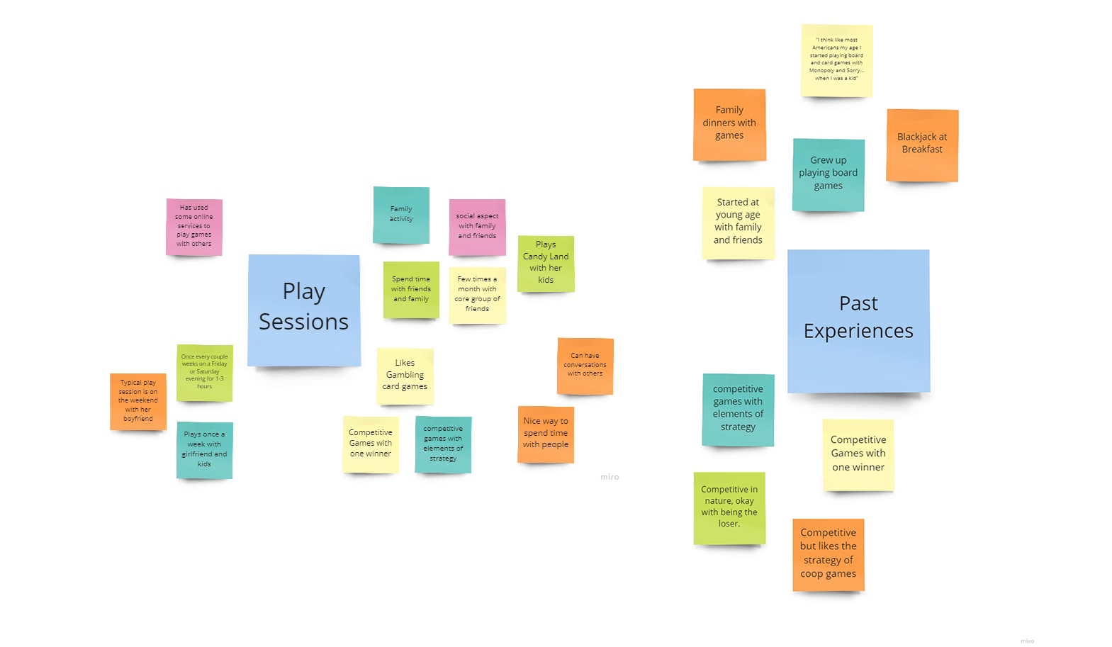
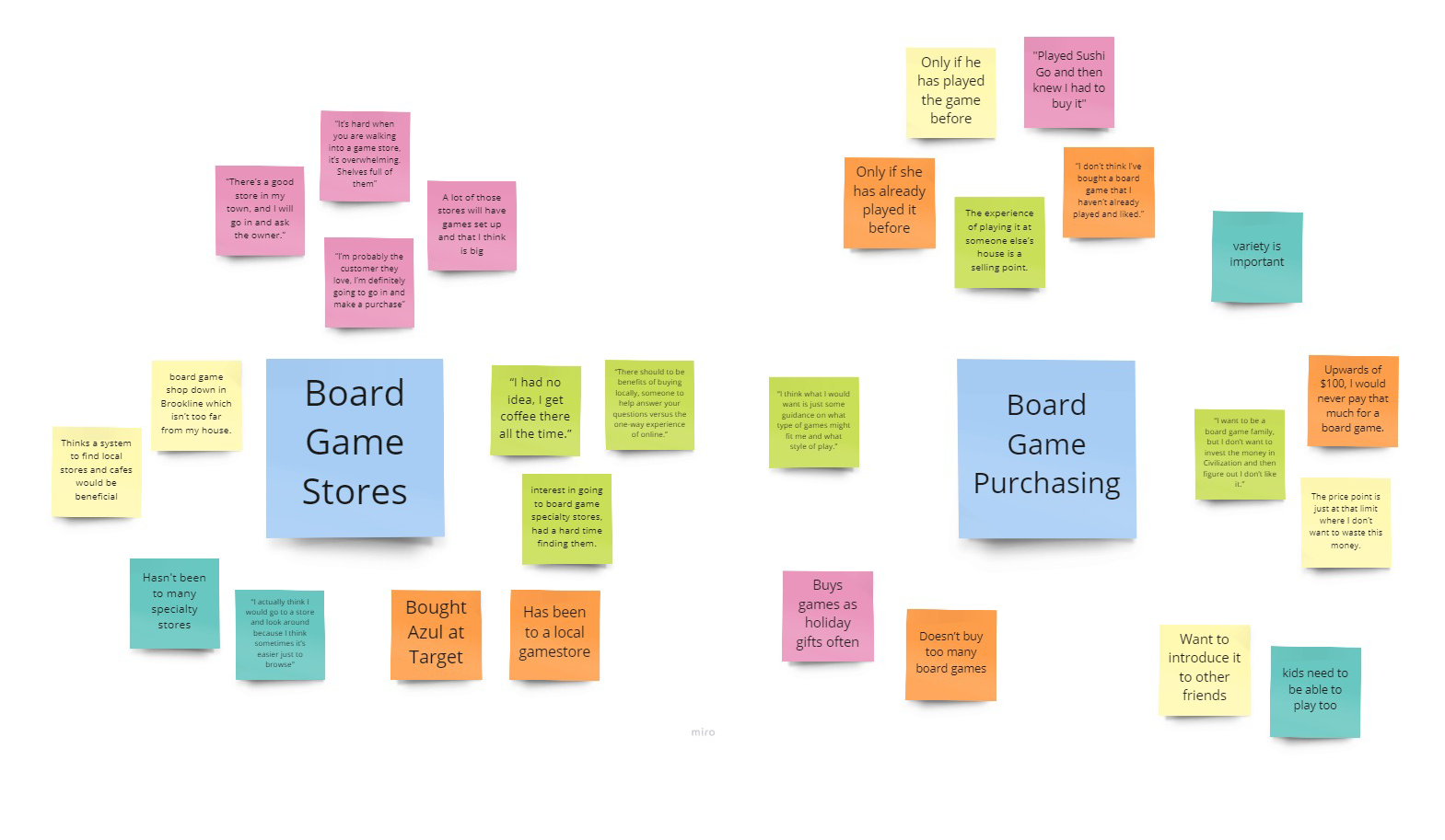
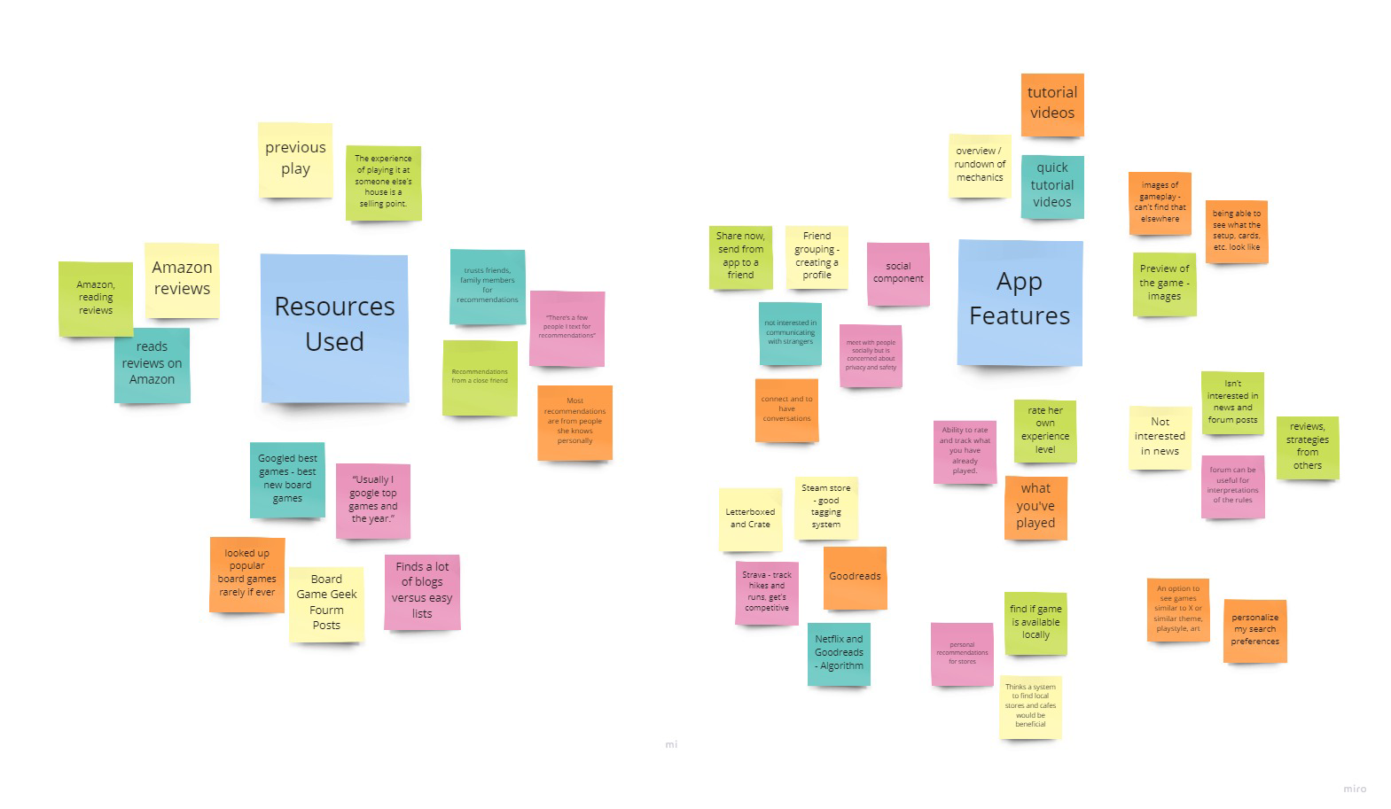
Hearing from potential users helped to reinforce my initial thinking, there was no single source for users to get board game recommendations. Multiple interviewees said they read Amazon reviews but struggled to decide if the game was a right fit. Each user had specific qualifiers they were searching for including mechanics, themes, age range, number of players, and more. In one circumstance a user bought a game that they thought they’d like only to feel like they wasted $50+ on a game they’d never play.
“I want to be a board game family, but I don’t want to invest the money in a game and then figure out we don’t like it.”
Kayla Gaudette, 34
Hearing a user’s personal struggle helped me to empathize with my user base and better understand their motivations.
A few of my users had been to board game stores before and mentioned it was helpful to work with a store manager. In the best cases, a game could be played before purchasing to make sure they liked it. Users who hadn’t expressed interest in finding nearby locations and said they weren’t aware of places nearby.
At the end of my preliminary research, I had three main issues I planned to address with my app.
Find Games
How do we help users find board games that fit their playstyle?
Find Locations
How can we help users find nearby locations to try games for the first time or buy them?
Rate and Review
How can we allow users to rate and review games they already own and see reviews from others?
Personas
I also constructed two personas based on the insights from the research.
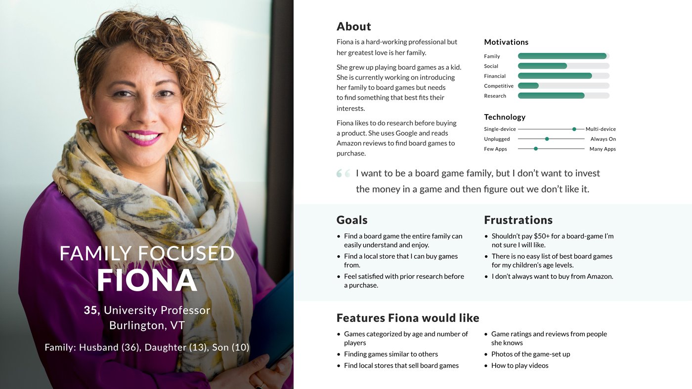
Family-Focused Fiona
Wants to find games that the entire family can play together

Hobbyist Hank
Wants to try new tabletop games similar to what he’s already playing
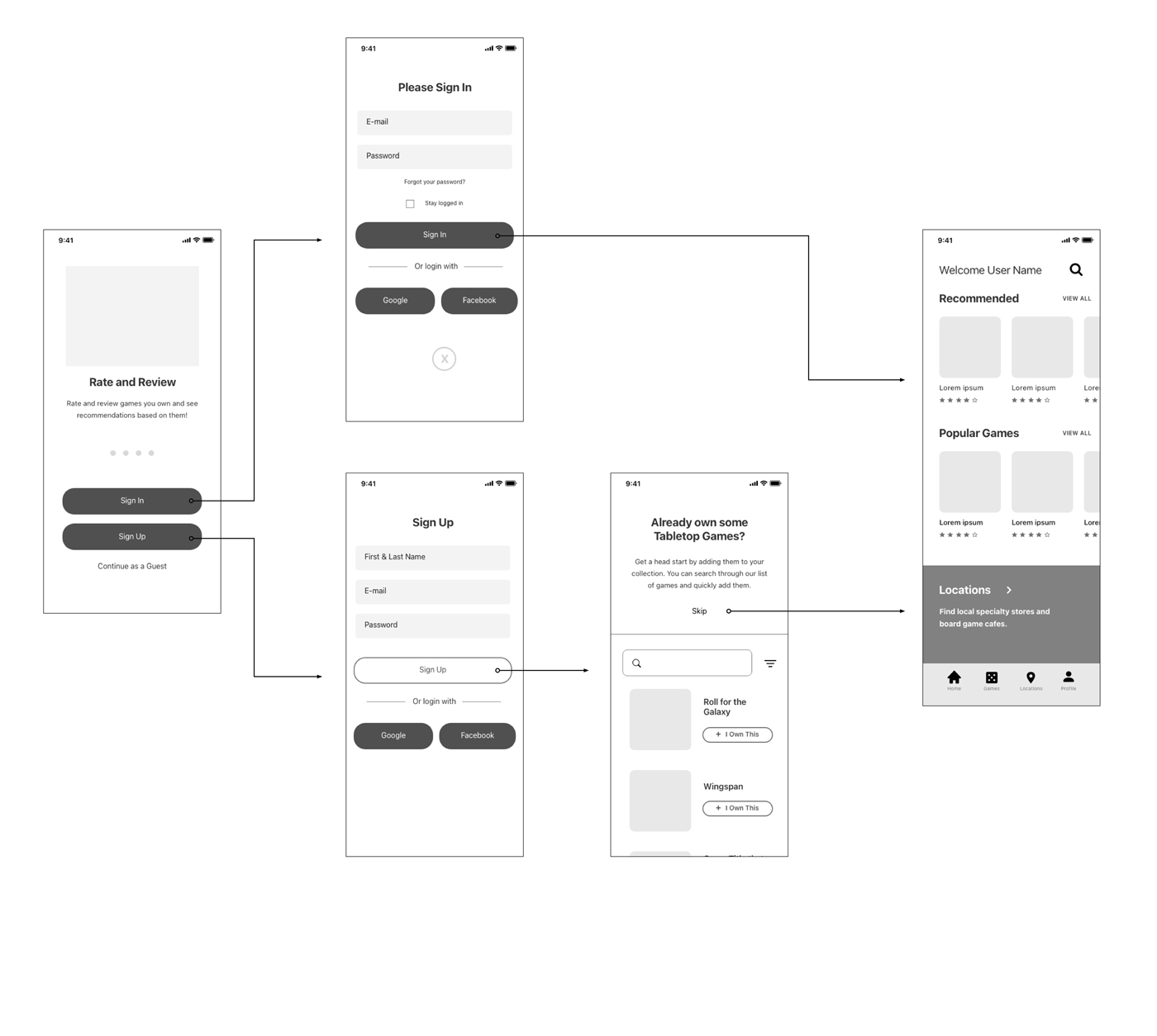
Mapping out user flows to address the app’s main features
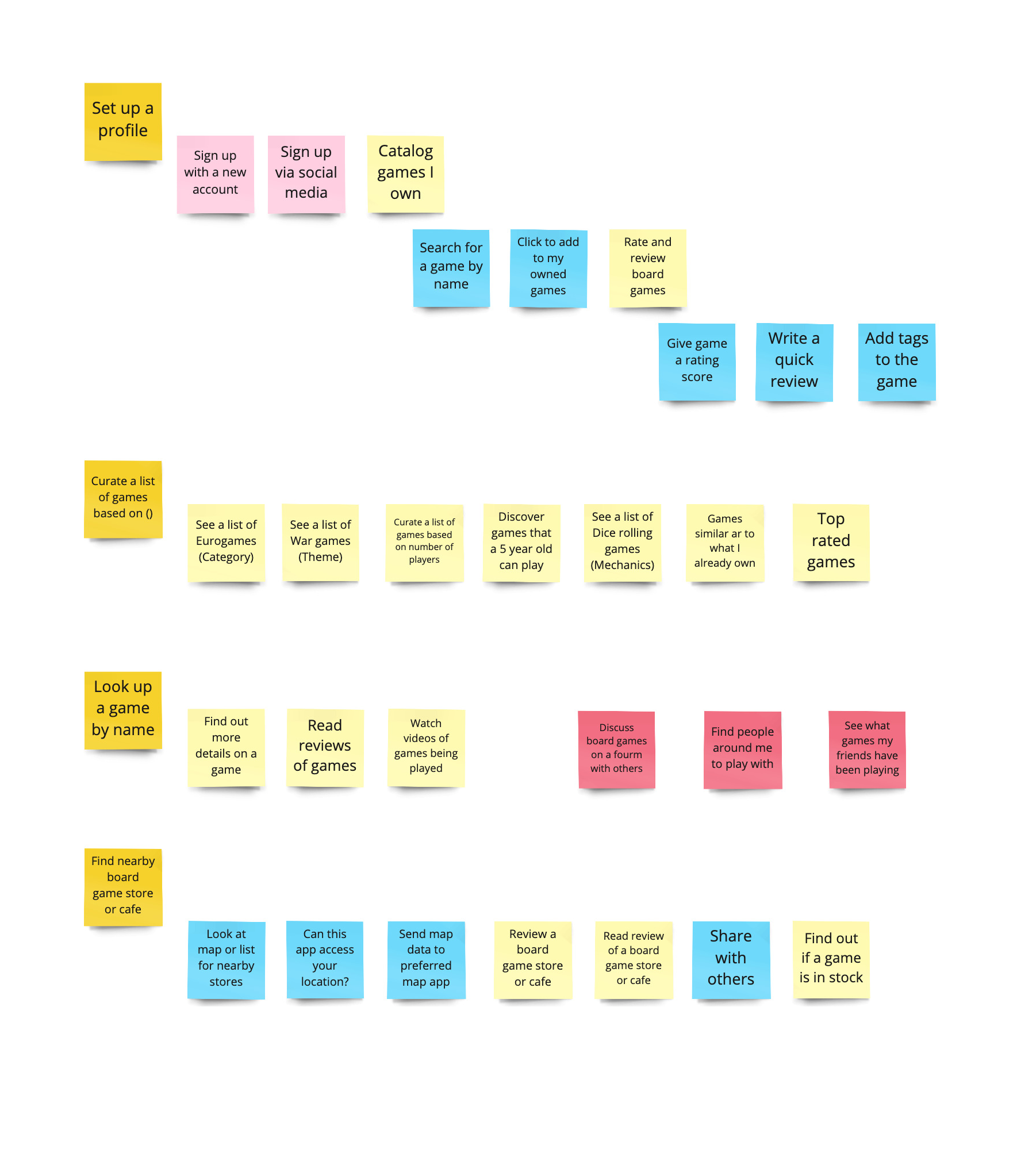
User Stories
From these three questions and my personas, I was able to put myself in the shoes of my users to understand the tasks they’d need to achieve. I built user stories to build my foundation as I started to build out the app’s architecture.
Three of my user stories addressed social features, these would have to be placed on the back-burner in order to address the Minimal Viable Product. With this decided I was able to build a site map.
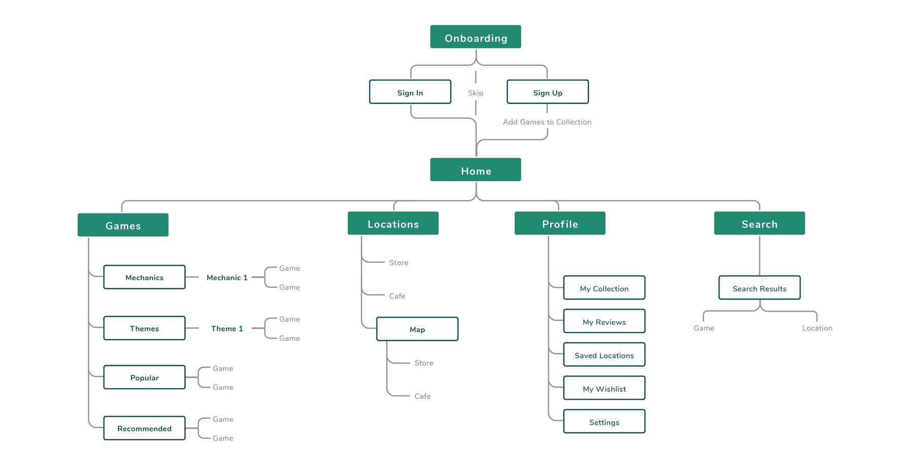
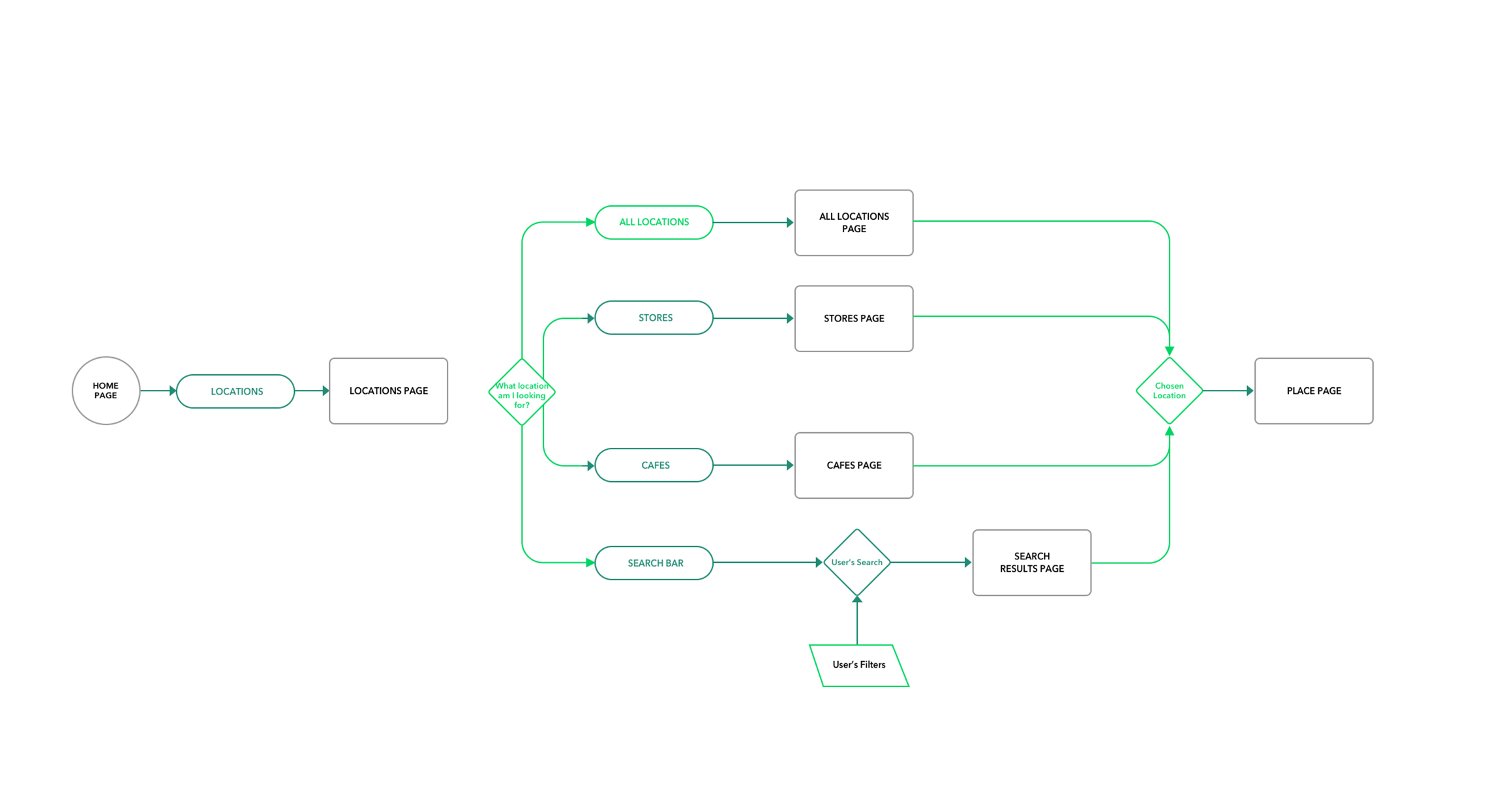
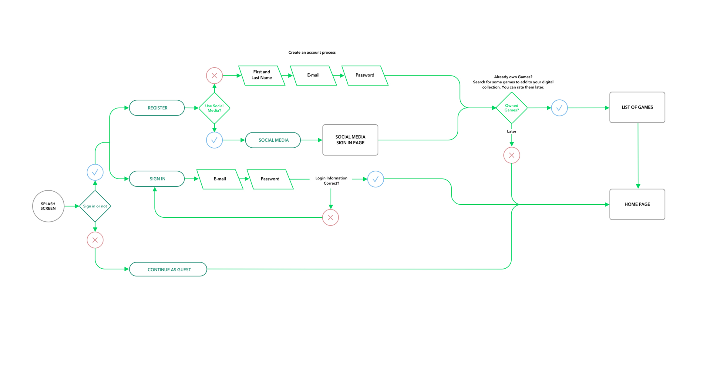
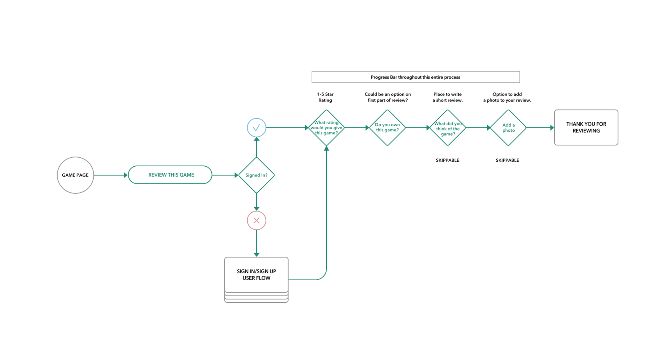
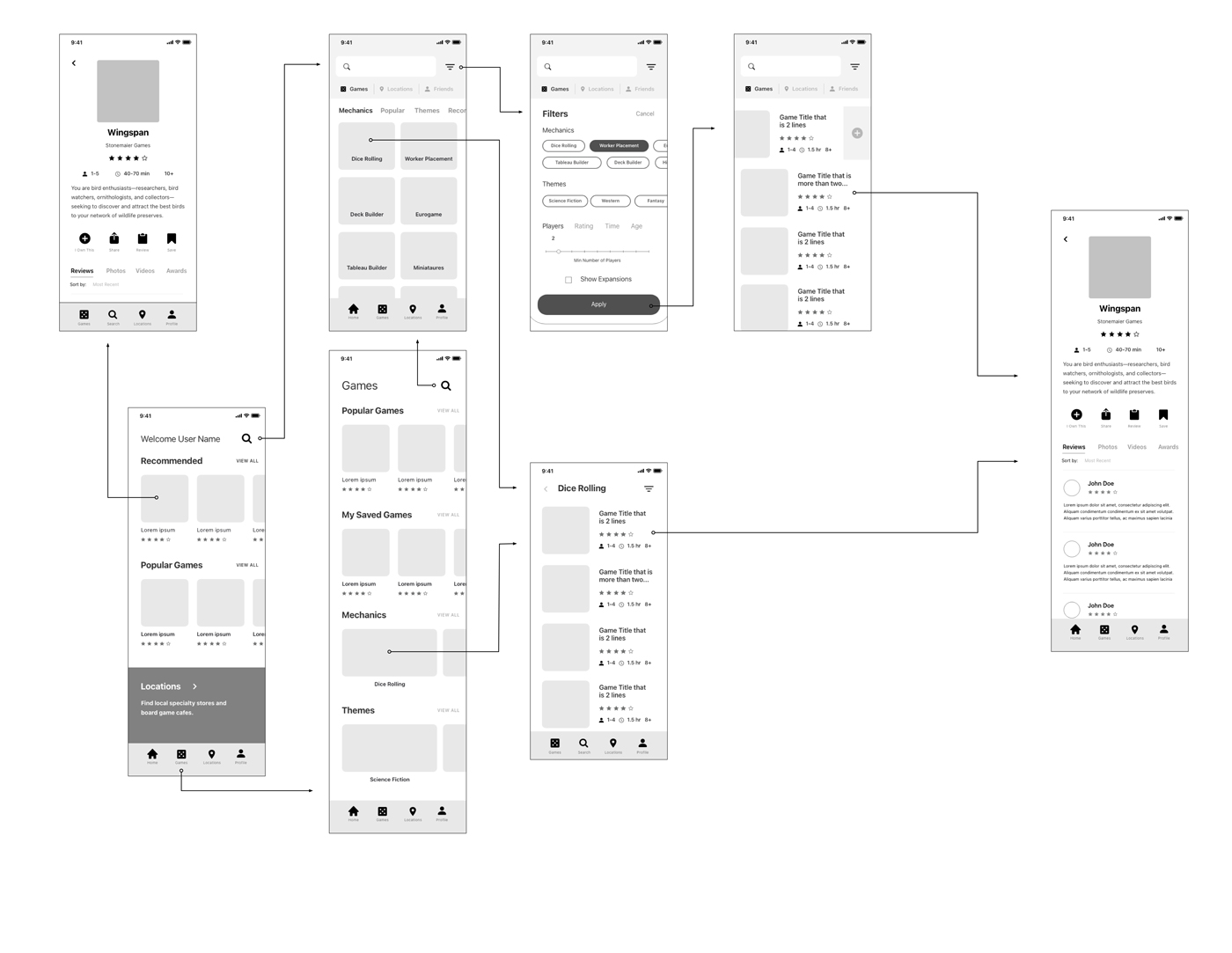
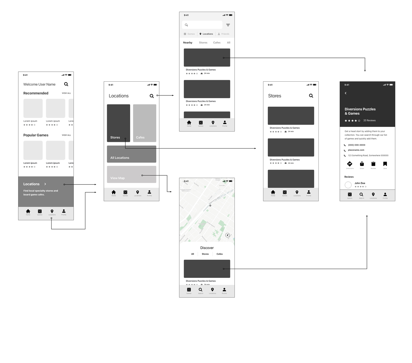
Site Map
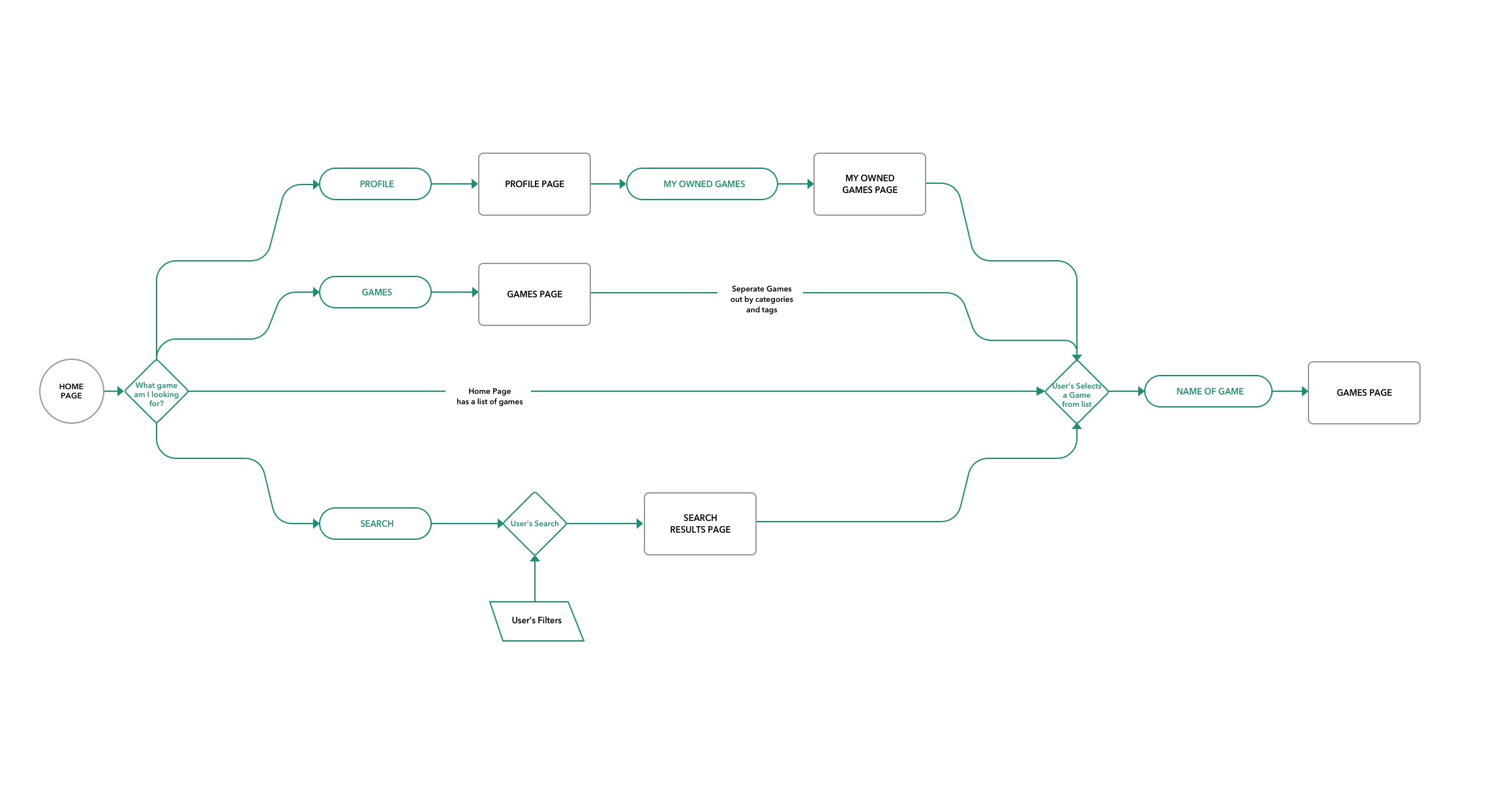
User Flows
Sketching and prototyping from user research
Based on these flows I created a sketched prototype that I could test with users to make sure the app’s red routes could be navigated without issue.
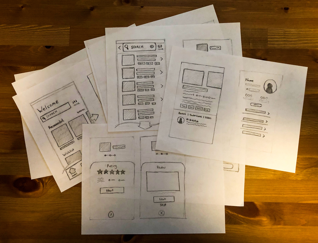
The results of my testing were positive with each user able to complete the tasks of finding a game, reviewing a game, and finding a location. I was also able to get valuable feedback which would be helpful during wireframing.
Updating the prototype based on insights from user testing
Search
Feedback and Insights
- The search function was used immediately by all users when asked to find a game
- The user’s expectation was that the search bar would be able to search not only games but also locations and other profiles
Iteration and Redesign
- I designed a toggle to switch between Games, Locations, and Profiles when searching. This would prevent the user from getting results from things they weren’t looking for and easily categorize the search
- The search bar was also made available on most pages for easy access
- In the real world, I would prioritize the search feature to a development team

Home Page
Feedback and Insights
- Users wanted a more personalized home-page
- Users said the locations feature wasn’t prominent enough
- The Home page and Games page design was too similar
Iteration and Redesign
- Added user name to the homepage for personalization
- Added a locations section to the homepage to highlight the feature, this would later be a personalized nearby locations section
- Changed the categories on the game page, did a major redesign of the game page in the high-fidelity mockups
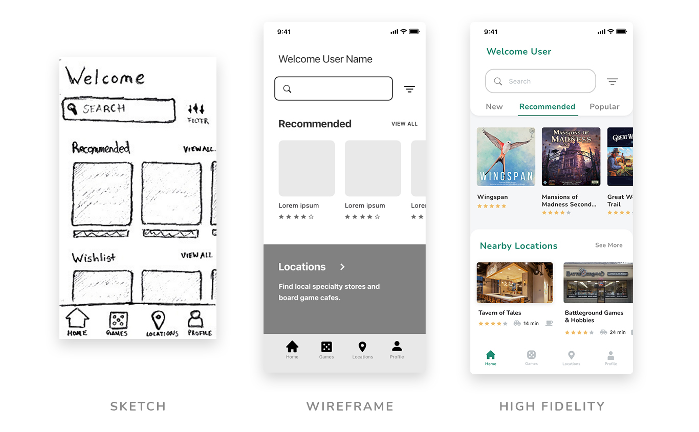
Wireframes
With all these insights I build wireframes of the app in Adobe XD. I sped up the process by utilizing some wireframe kits. I set up wire flows to make sure all parts of my red routes were planned for.
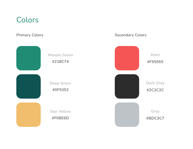
Style Guide
Before starting on my high-fidelity prototypes I took time to build a style guide for the app. The style priorities were:
- A primary focus is the games and information, reduce distracting elements
- Fun feeling, match the attitude of tabletop games
- Contemporary and effortless design
Based on these priorities I developed the style guide below.
- The background color of the app would be white and light gray for easy reading
- Bright green, blue, and yellow colors were used for accents to highlight important elements and bring a feeling of fun
- Both fonts were selected for their readability, Nunito letterforms were rounded which added a sense of leisure
- Graphic imagery was also developed for the onboarding screens. All other imagery besides the icons would be pulled from games or locations
Developing high fidelity prototypes and testing with potential users
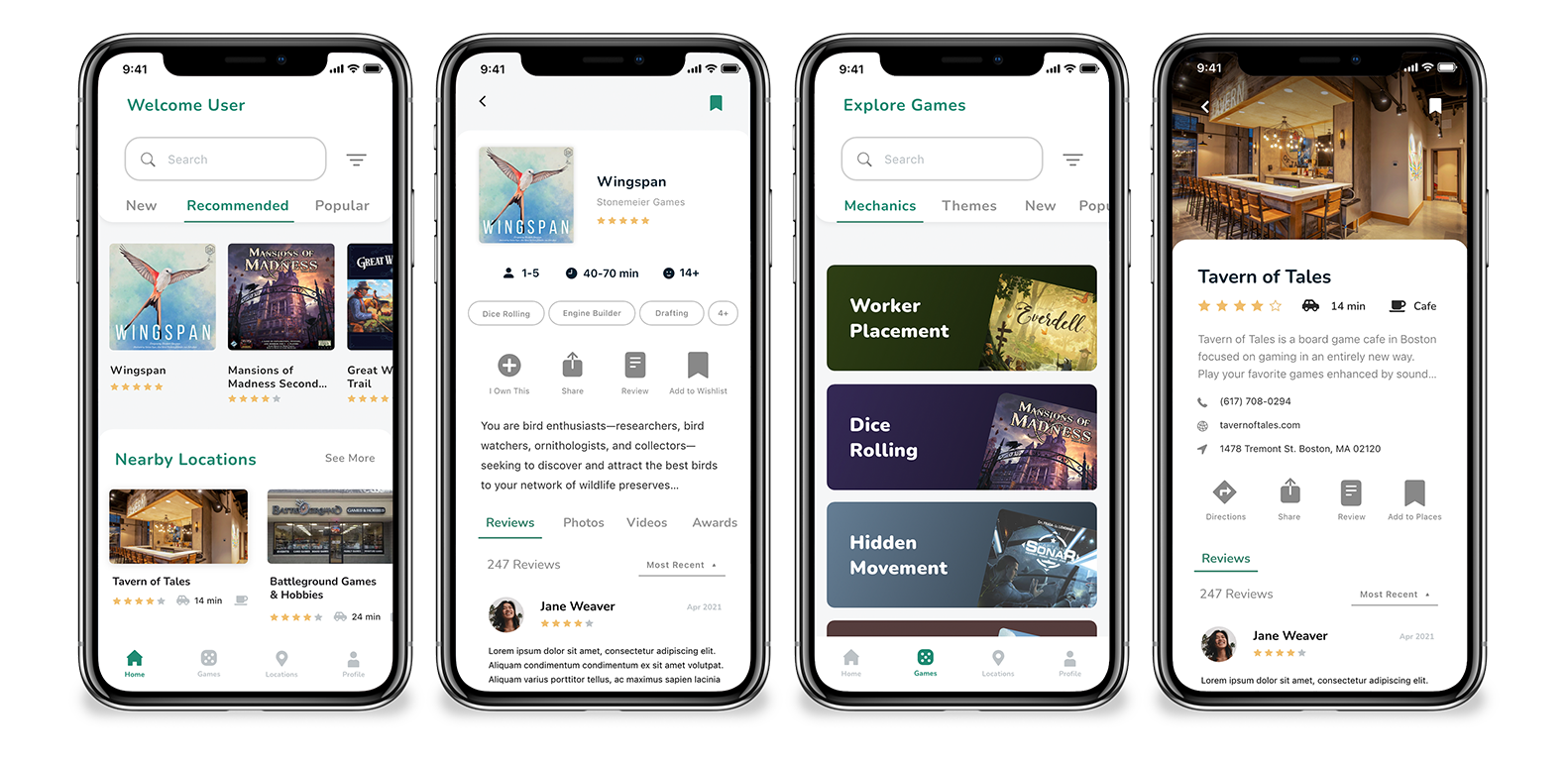
When translating my wireframes to high fidelity I made changes to the structure of multiple pages to keep a consistent look across the app. I originally set up a tab system on the search page based on a wireframe kit. However, I found the system fit on multiple pages and would reduce vertical scrolling to access certain categories. This also made the design of the home page and game page more distinct. I built a tray system to add a sense of depth to the design and to keep the placement of elements consistent.
The tray system also helped when developing micro-animations. Sliding trays in and out built upon the sense of depth in the design. I also created a small animation when swapping between tabs. The animation is fluid and quick with a small snap to it which brings a fun and exciting energy.
After creating high-fidelity prototypes I did in-person usability tests with five new users. I asked them to complete similar tasks as my initial testing while also asking questions about the app’s look and feel. I was excited that the overall impressions of the design were positive.
Updates to the high fidelity prototypes
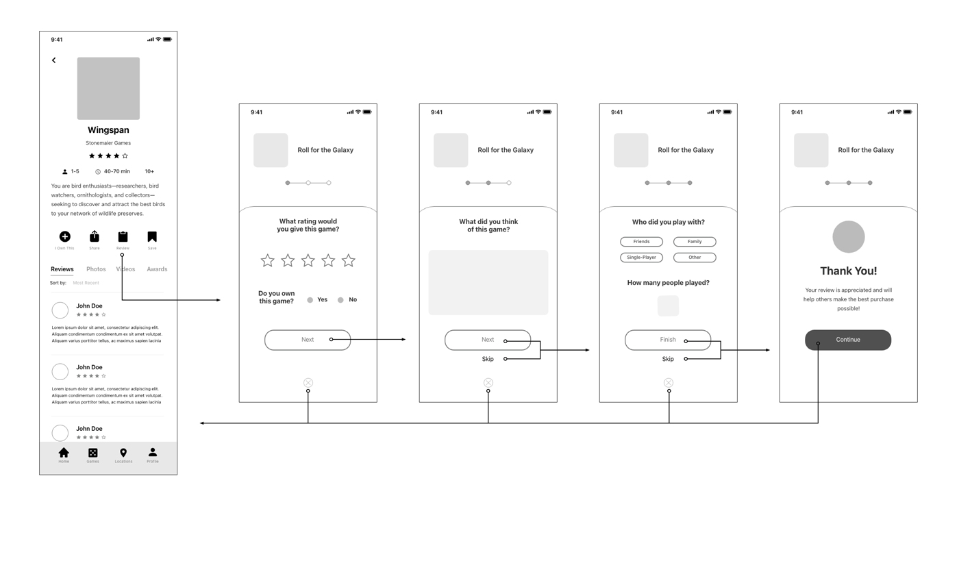
Feedback and Insights
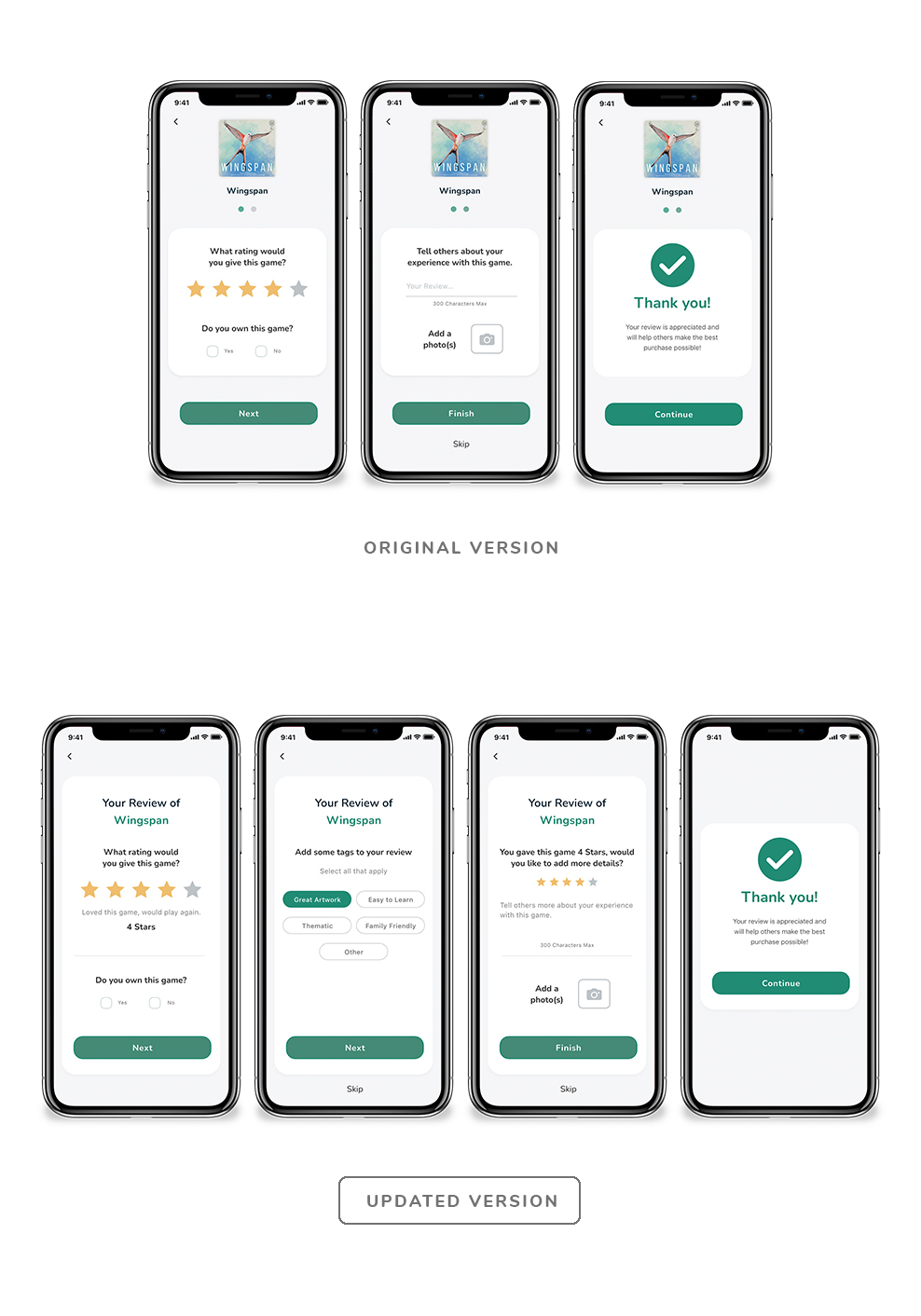
- Almost all the participants were confused by the progress circles on the review screens, some testers tried to click on them while others just questioned the purpose
- Three participants wanted extra options in the review, including an option for superlatives and what the star rating means
- Users liked the quickness of the review process and appreciated options to skip sections
- Locations on the homepage don’t include icons for Cafe or Store
Feedback and Insights
- Progress circles were removed completely to prevent confusion
- A description was provided for each star rating
- Superlatives section was added to the second screen of the review process allowing users to add tags to the review as an option
- The overall structure of the review screens was updated to give content more room
- A statement was added to the third screen of the review reminded the user of their score to help give context to their written review
- All locations were given icons
Reflections and Next Steps
As the first capstone project for my UX/UI course, I can safely say it was a learning experience. In my current role as a designer, I don’t get to talk or learn about my end users. Taking time to do user interviews and testing helped to open my eyes to their struggles and in many cases, it was just fun to discuss and learn about their experiences.
There were a few times in the process where I ran into a drawback. When creating my style guide I initially used a bright orange for headings and buttons but it had a low accessibility score. This reinforced the importance of checking my brand style with accessibility guidelines early and keeping it at forefront of any updates to the app. When planning for my animations I realized I hadn’t done a good job of grouping, organizing, and naming my layers. This caused me to take extra time to do so. I’m confident that my next project will be much better managed.
Going forward, I would plan on expanding the social features of the app. These weren’t part of the MVP but would include an expansion of the profile page, a section to show off a user’s favorite games, and an option to create lists. Another idea from the research interviews was an option to find local people to group up with to play games together. All of these would be great features to add that fit within the app and user’s goals.
- Eco-Stylist | UX/UI Design
- Sub-Track | UX/UI Design
- Savr Design Sprint | UX/UI Design
- Tabletop Detective | UX/UI Design
- PSU Admissions
- PSU Videography
- PSU CESLife
- PSU E-mail Design
- PSU Social Media
- PSU Photography
- PSU Advancement
- PSU Academic Programs
- PSU Alumni Relations
- Grand Hotels of the White Mountains
- PSU Athletics
- Tidbit Crackers
- Arts & Events at PSU
- Sidore Lecture Series
- The People's Forest
- Plymouth Magazine
- Academic Catalog