Creating a mobile experience for tracking subscriptions
Duration: 1 Month, August-September
Role: UX/UI Researcher and Designer
Key Skills: Interviews, Personas, User Stories, Sitemaps, User Flows, Wireframing, Prototyping, User Testing, Visual Design
Sub-Track is a desktop app that helps users keep track of subscription services they are currently signed up for.
Problem Statement
Currently, Sub-Track is a desktop app that is not mobile-friendly. This is leading to a reduction of business to potential users and potential loss of active users.
The Solution
Allow users to easily view a list of their subscriptions on a mobile device while providing a clean and easy-to-understand user experience. The solution provides options to create alerts and the ability to unsubscribe from a subscription within the app.
Understanding my users through research
Beginning with some secondary research on subscription services and budgeting I was able to gain some insights into my userbase.
- In a 2020 study, 23% of respondents underestimated what they spent on subscriptions by $25 to $99, and another 27% underestimated subscription spending by $100 to $199.
- Most subscriptions charge automatically making it easy for users to lose track causing them to charge in perpetuity.
- Subscriptions are set up to charge monthly or weekly meaning most users haven’t calculated how much money a service costs per year.
Target Users and Market
My main target market is users over the age of 30, split evenly between men and women. They are trying to be more budget-conscious and use desktop and mobile apps equally. With this information, I created proto-personas based on two potential users that could be updated in the future with more insights. The personas were based on a current user and potential new user.
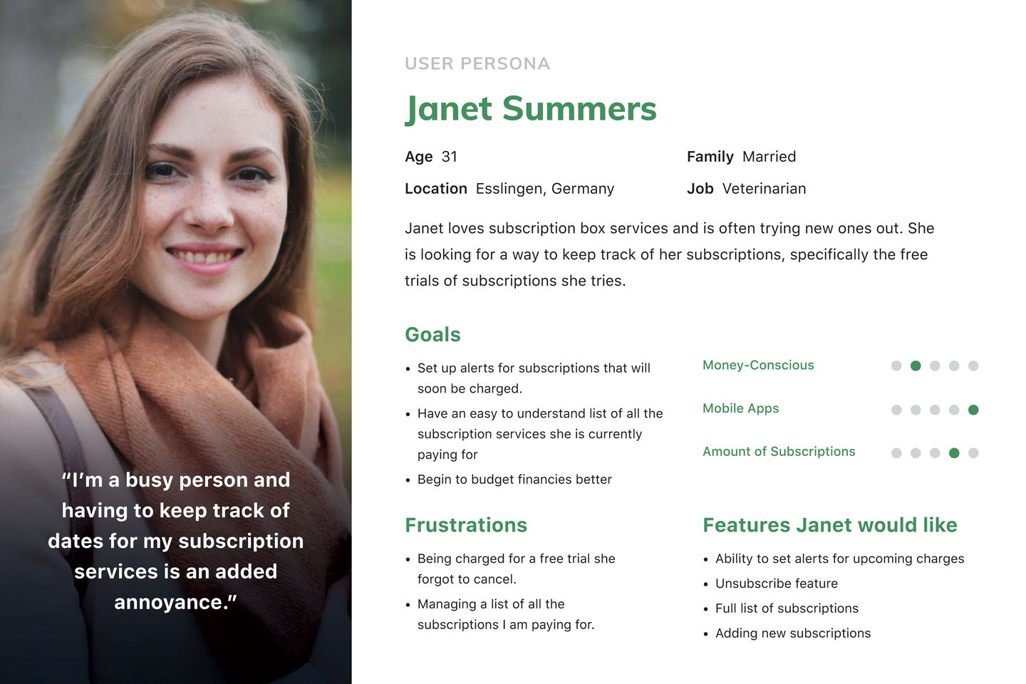
New User
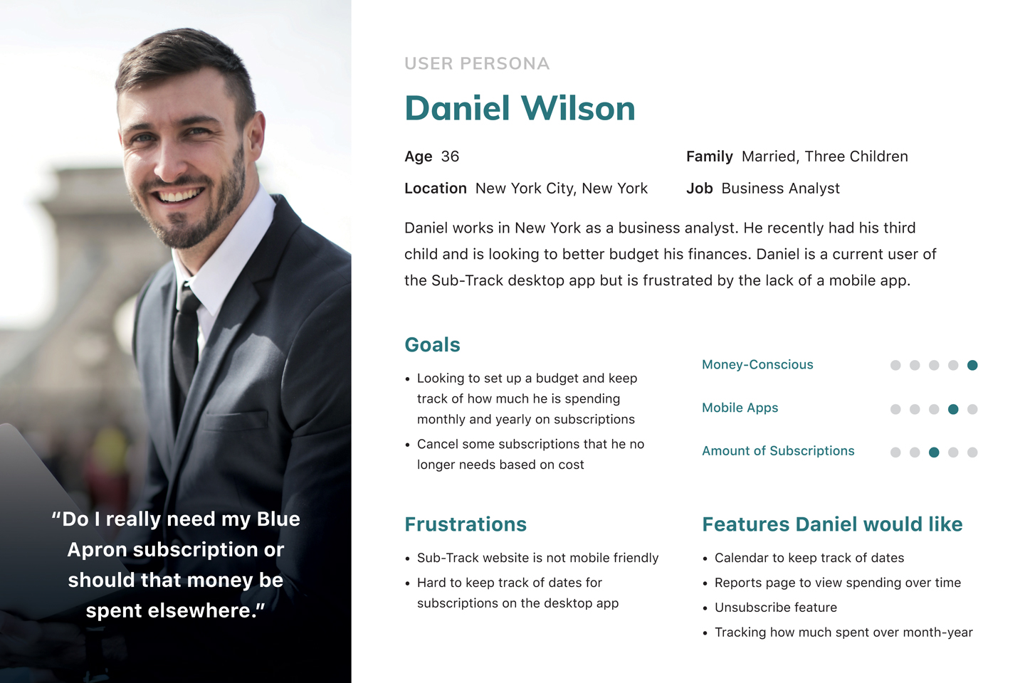
Current User
I then downloaded some apps created by industry leaders to see how others approached this problem. These apps included TrackMySubs, Subscription, and Bobby as well as some general financial helper apps like Mint and TrueBill. The apps specifically designed for subscription tracking were poorly designed and the overall user experience was lacking. Some of the specific problems I encountered were:
- Cluttered design with low visual hierarchy leads to a confusing experience
- Limits to how many subscriptions could be added and tracked
- Colored backgrounds made it hard to read text
My goal would be to provide a much cleaner and easier-to-use experience. The general financial apps were much better designed but didn’t offer options to just review subscriptions. These apps also connected directly to the user’s bank account, something I wasn’t sure my users would like. TrueBill was the only app I tested that allowed users to cancel their subscription directly from the app. Since this was a requested feature for Sub-Track’s mobile app I took notes on how it was implemented.
I was able to gain multiple design insights from these lightning demos and I created a list of the following to build into my app:
- The homepage should provide information on upcoming charges and a cost overview
- Ability to set specific alerts for each subscription service
- General information should be presented quickly and cleanly with options to see more details a click away
- Calendar and reports pages are just as important as a full list of subscribed services to make budget decisions
Creating User Flows
Combining what I had learned from research I developed three flows for the main tasks a user would complete.
- Adding a new subscription
- Creating an alert for a subscription
- Unsubscribing from a subscription
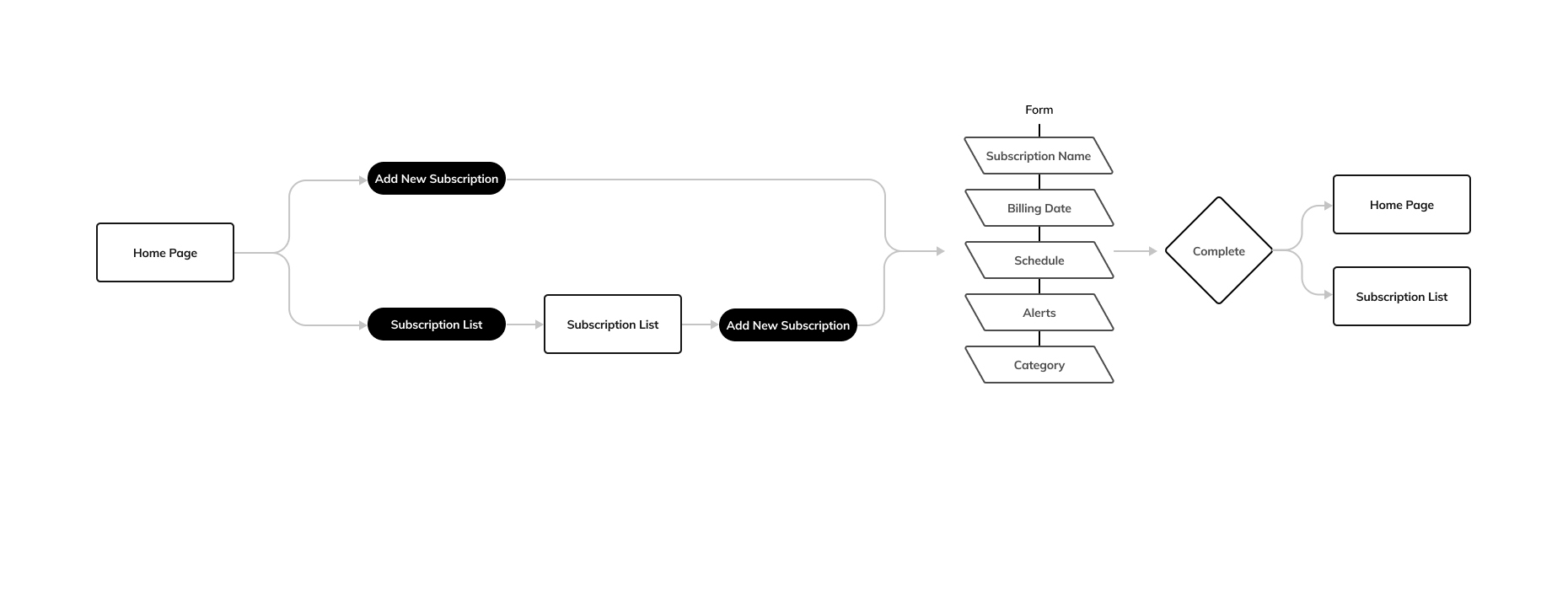
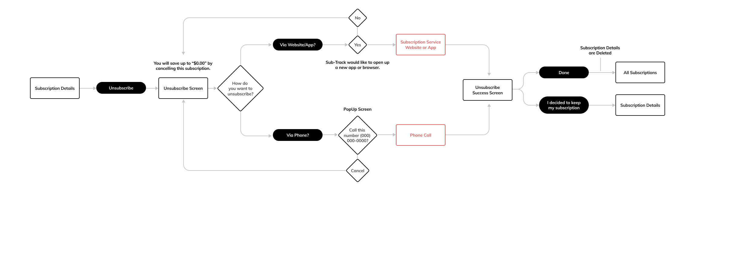
When designing the unsubscribe flow I realized that users would have to leave the app in order to complete this process. Since the final act of unsubscribing would be done outside of the app there would be no way to know if the user unsubscribed or not. Because of this, I added a confirmation screen upon return that would confirm a successful unsubscribe. Only then would the details be removed from the account.
I then sketched out preliminary designs of the main screens. The plan was for the main screens of the app to mimic those in the desktop version with some slight changes for the homepage which would focus on upcoming subscription payments with the option to view the full list.
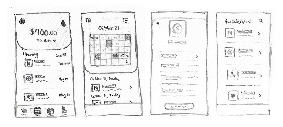
Design Sketches
Building on the initial design to create a working prototype
Before designing the app I created a logo and selected colors that would be used in both the branding and design. A mint green color was chosen for its relation to finances and a dark blue that would be used for background shapes which would help the white text and green accent color stand out.
To work within my time constraints I built the low-fidelity version of the app using a UI design kit, Montra. The kit was modified with Sub-Track brand colors and some elements from my initial sketches. In my sketches, I hadn’t planned to have a hero button in the taskbar but after working through the design I felt it would be the easiest way for users to begin the Add Subscription flow. It also kept the button present throughout many of the screens instead of only on a select few.
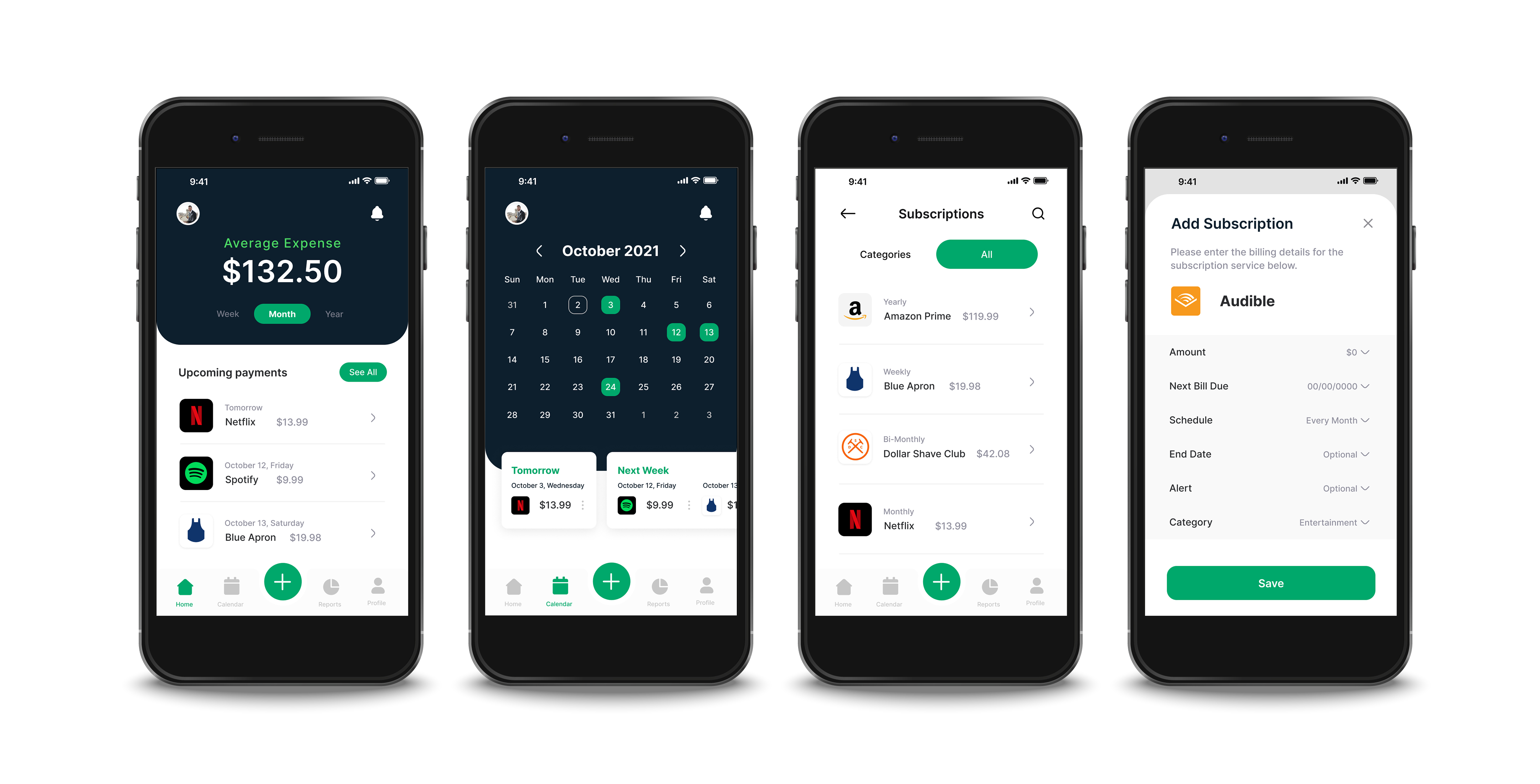
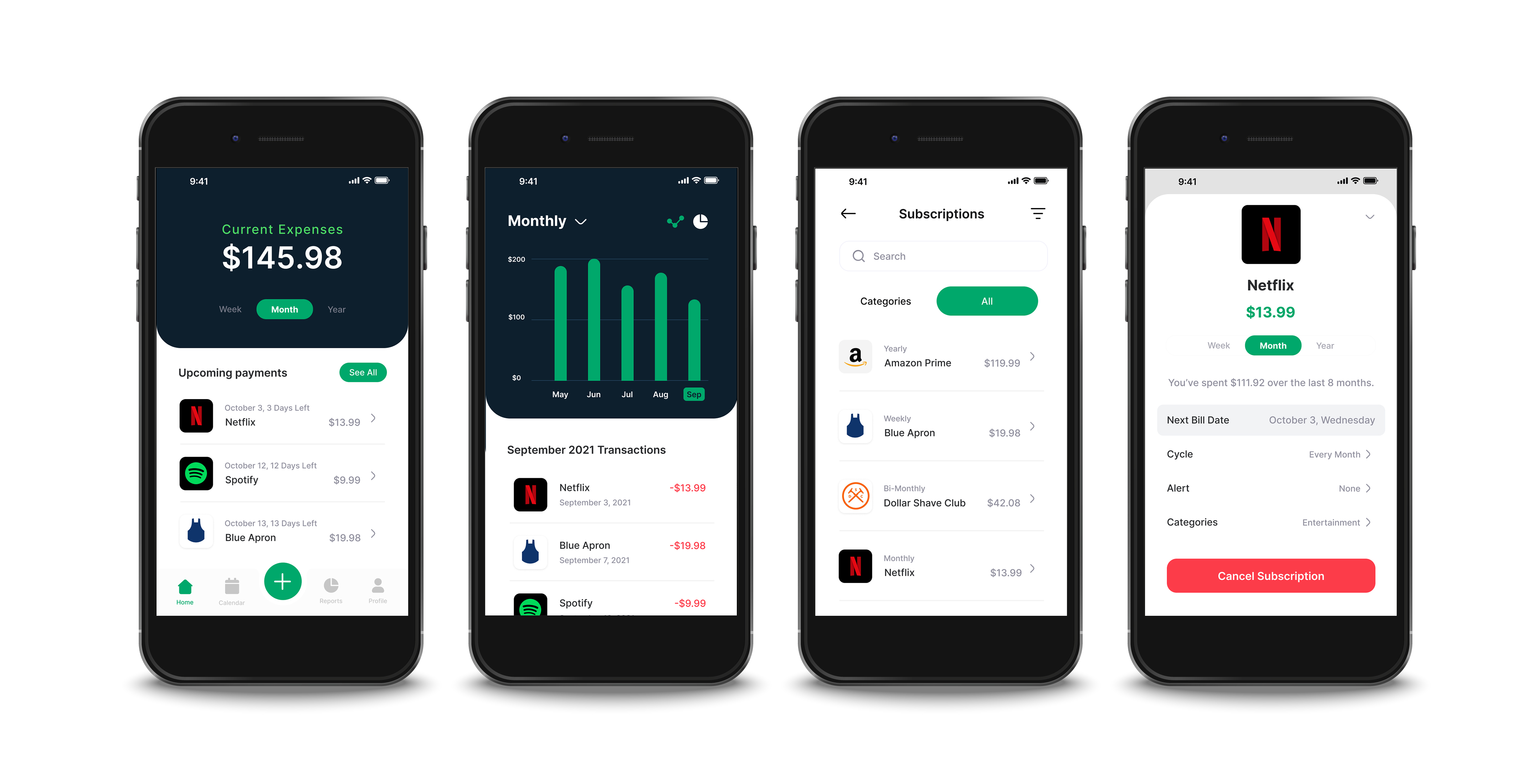
Example Screens from First Prototype
Updating the prototype based on user testing insights
I made plans to test this version of the app with five users. Since I didn’t have time to do user interviews in my preliminary research I chose to ask them questions before the test. Some of the notes I gathered included:
- All users weren’t currently using any software to budget their subscriptions though some kept track of their overall budget through Microsoft Excel
- Most users had 10+ subscription services
- Each had a specific experience when they missed out on canceling an app and paid money they didn’t want to spend
- Cost and lack of use were both high indicators to decide to cancel a subscription
- About half of the users were cautious about attaching their bank account to the app
After answering my questions users were given three tasks to complete during the test:
- Create an alert for Netflix subscription for one day before it charges
- Add a new subscription for Audible
- Cancel your Netflix subscription through the app
Overall users had no issues completing the tasks set for them. However, there were some moments in the test where users were confused.
Unsubscription Task
One instance of this came from the unsubscription confirmation page. Two of my users questioned the need for the confirmation page.
“Didn’t I already cancel the subscription, not sure why I am being asked again now?”
Derek
When questioned further about their confusion they both mentioned they didn’t understand that they had left the app to cancel the subscription, and the language on the pages wasn’t clear enough. Another point of user uncertainty in the unsubscription task came from the Cancel by Phone button. All of my users clicked on this first then immediately canceled when they realized they’d be making a phone call. Multiple said they’d never cancel a subscription via phone call unless it was the only option.
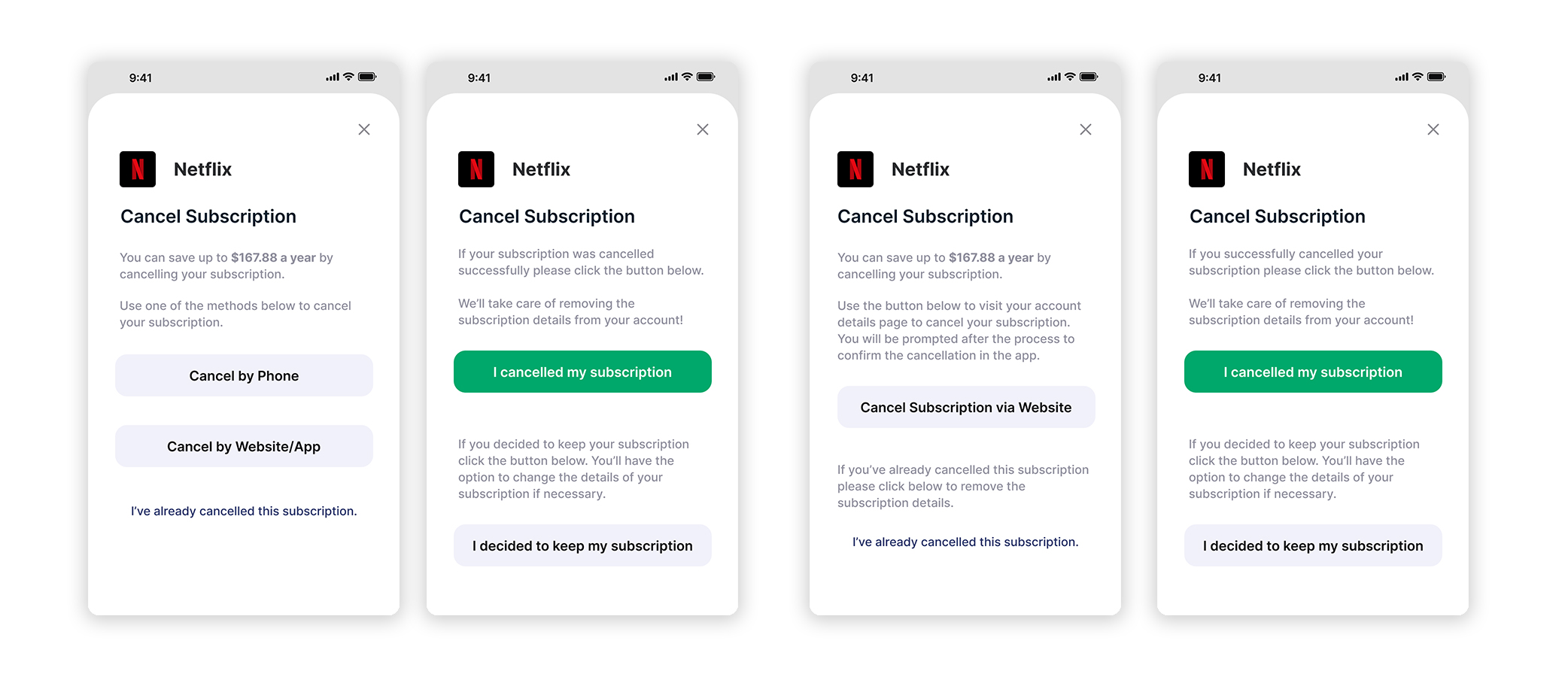
Changes made to Cancel Subscription screens
Redesign
To address this issue I reworked the language to help users understand the full unsubscription process. An example of this was changing “If your subscription was successfully canceled” to “If you successfully canceled your subscription”. This prevented the user from questioning if the process was actually successful. A small animation was added to the Cancel Subscription button to indicate a webpage opening. I also removed the “Cancel by Phone” option since no users were interested in using this function.
Creating Alerts
When given the task to create an alert for Netflix three users first went to the notification icon in the top right. No options to create an alert were on this page causing them to back out and instead click on the Netflix details page. In the first prototype creating alerts was done through a pop-up menu. A few users were dissatisfied with this format and the lack of confirmation for when an alert was set.
Redesign
With this feedback along with additional comments about the design of the main screens, I decided to remove the notification and profile shortcuts from the top part of the screen. The notifications list was moved to the profile page.
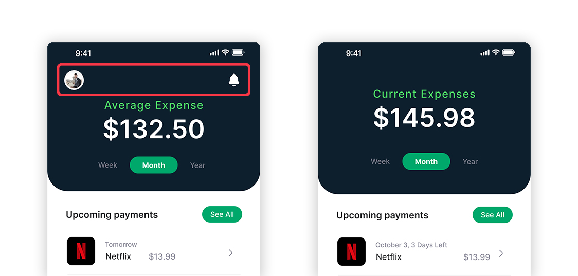
Changes made to Home screen
The alert creation process was changed to a page instead of a pop-up menu with a button to confirm the creation of the alert. It also included a quick description of what the alert would do.
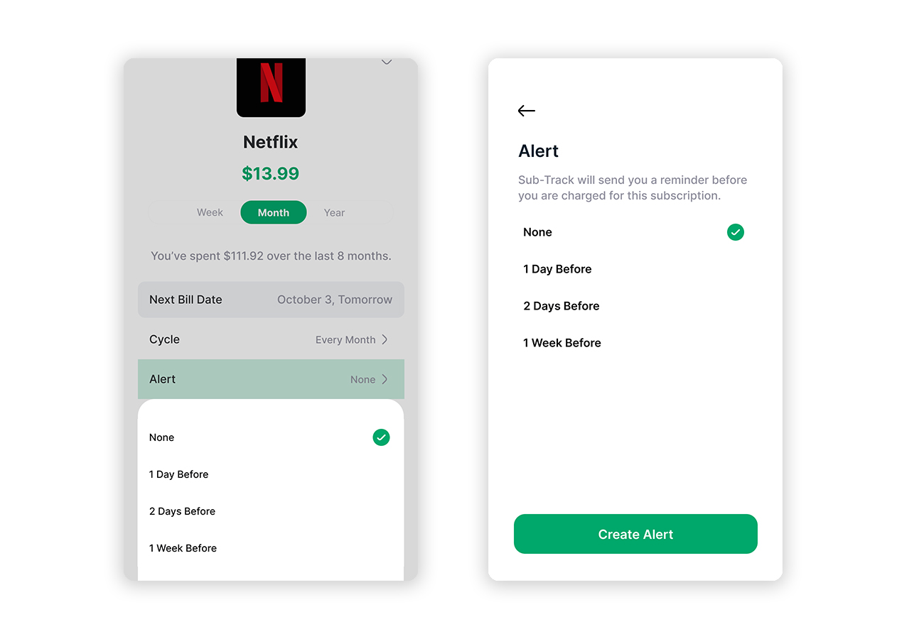
Changes made to Create Alert screen
Other minor changes to the app prototype included adding a sort function to the subscription list and changing the format of upcoming date listings.
Next Round of User Testing
With the updated prototype I tested the app again with five new users. The main focus for this test was aesthetics and design. Users were still instructed to complete the same tasks as before and each did with no issue.
Changing Color of Cancellation Buttons
Two users mentioned that the cancel subscription button is usually red on other apps they are familiar with.
Redesign
The color of the Cancel Subscription buttons was changed to red to be shown as a destructive action.
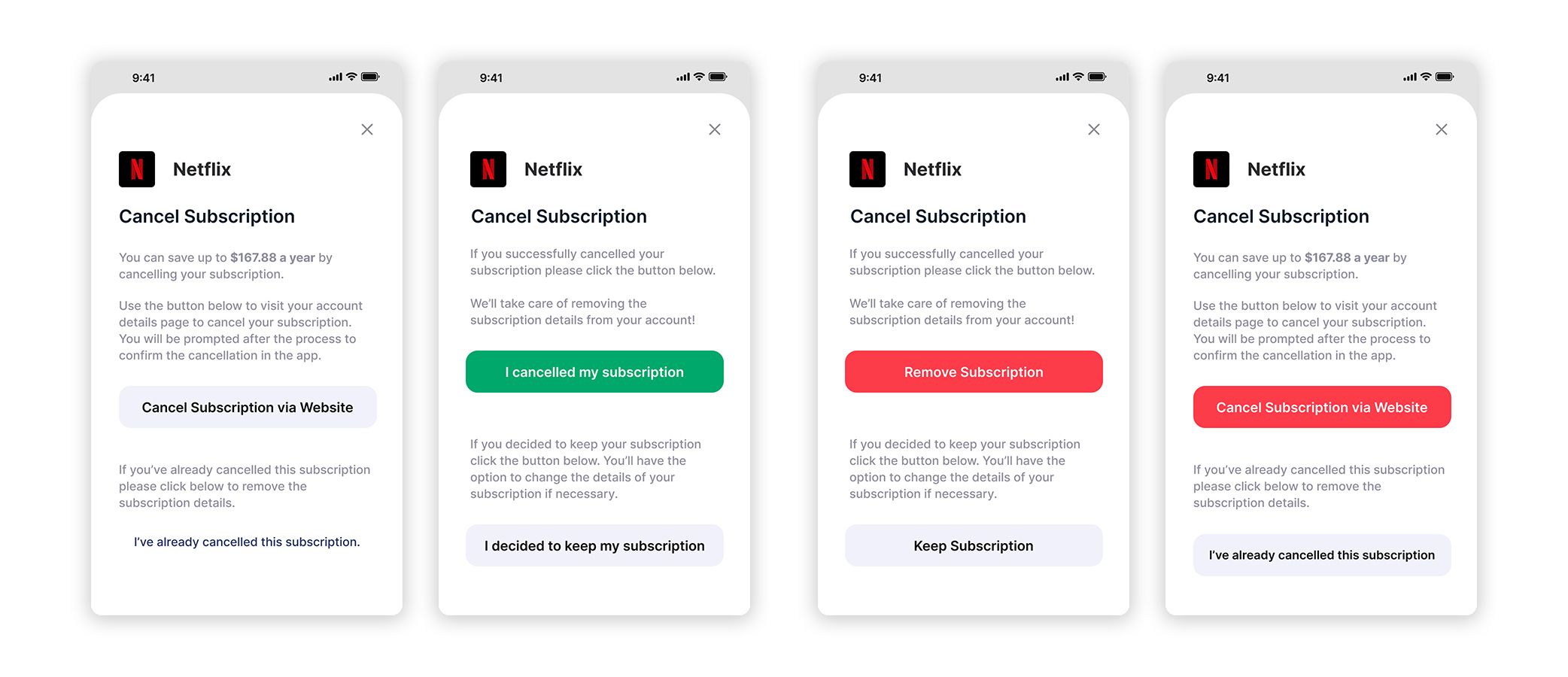
Final changes made to Cancel Subscription screens
Alert Creation Notification
Users liked the new alert creation page but still wanted an extra stage of confirmation for an alert set. Three users also asked for a custom alert option.
“I’d like a custom alert, so if there’s a show I’m watching that will end on a specific date I can remind myself to cancel the subscription then.”
Ron
Redesign
A green toast notification was added after creating an alert to give users another confirmation. A custom alert option was then added to the alert creation screen, users would have the ability to set a specific date and time for the alert.
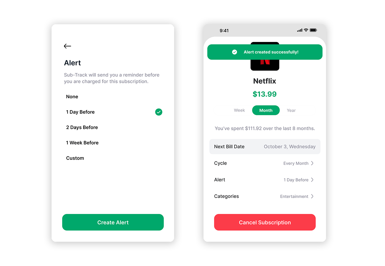
Final changes made to Create Alert screen
Additional minor changes were made to screens across the app to update formatting and to keep sections consistent.
Reflection and Next Steps
The biggest hurdle throughout the project was the Cancel Subscription feature. From my initial user flow, I knew that the process would require extra attention. In my user testing, most users were surprised that the option existed in the app and praised the ability to go directly to the cancel option on a subscription site. In most cases, the option to cancel a subscription is hard to find and requires multiple steps to go through. It was important that the process be as smooth as possible for the user inside the app and the first user tests helped to iron out issues for that flow.
Multiple users in both tests had requested an option to input other monthly costs ie. internet and phone bills. This feature fell out of the general scope of the platform but could be a potential addition in the future. Others were interested in setting a monthly budget and tracking expenses versus income. Again, I felt these would be a better fit in a general financial app that tracks more than just subscriptions.
- Eco-Stylist | UX/UI Design
- Sub-Track | UX/UI Design
- Savr Design Sprint | UX/UI Design
- Tabletop Detective | UX/UI Design
- PSU Admissions
- PSU Videography
- PSU CESLife
- PSU E-mail Design
- PSU Social Media
- PSU Photography
- PSU Advancement
- PSU Academic Programs
- PSU Alumni Relations
- Grand Hotels of the White Mountains
- PSU Athletics
- Tidbit Crackers
- Arts & Events at PSU
- Sidore Lecture Series
- The People's Forest
- Plymouth Magazine
- Academic Catalog