Savr Design Sprint
Preparing Users to Cook New Recipes
Duration: 1 Week
Role: UX/UI Researcher and Designer
Key Skills: Design Sprint, Lightning Demos, Prototyping, User Testing, Visual Design
Problem Statement
Savr gets a lot of positive feedback about the quality of their recipes but now they need to help users accurately and easily follow instructions.
The Objective
The main focus of this Design Sprint would be creating a better experience for users during the cooking process. My solution would be a feature for the Savr mobile app.
Understanding my users from research insights
For this Design Sprint, I was given an overview of the app along with a persona, a user interview, and quotes from other users.
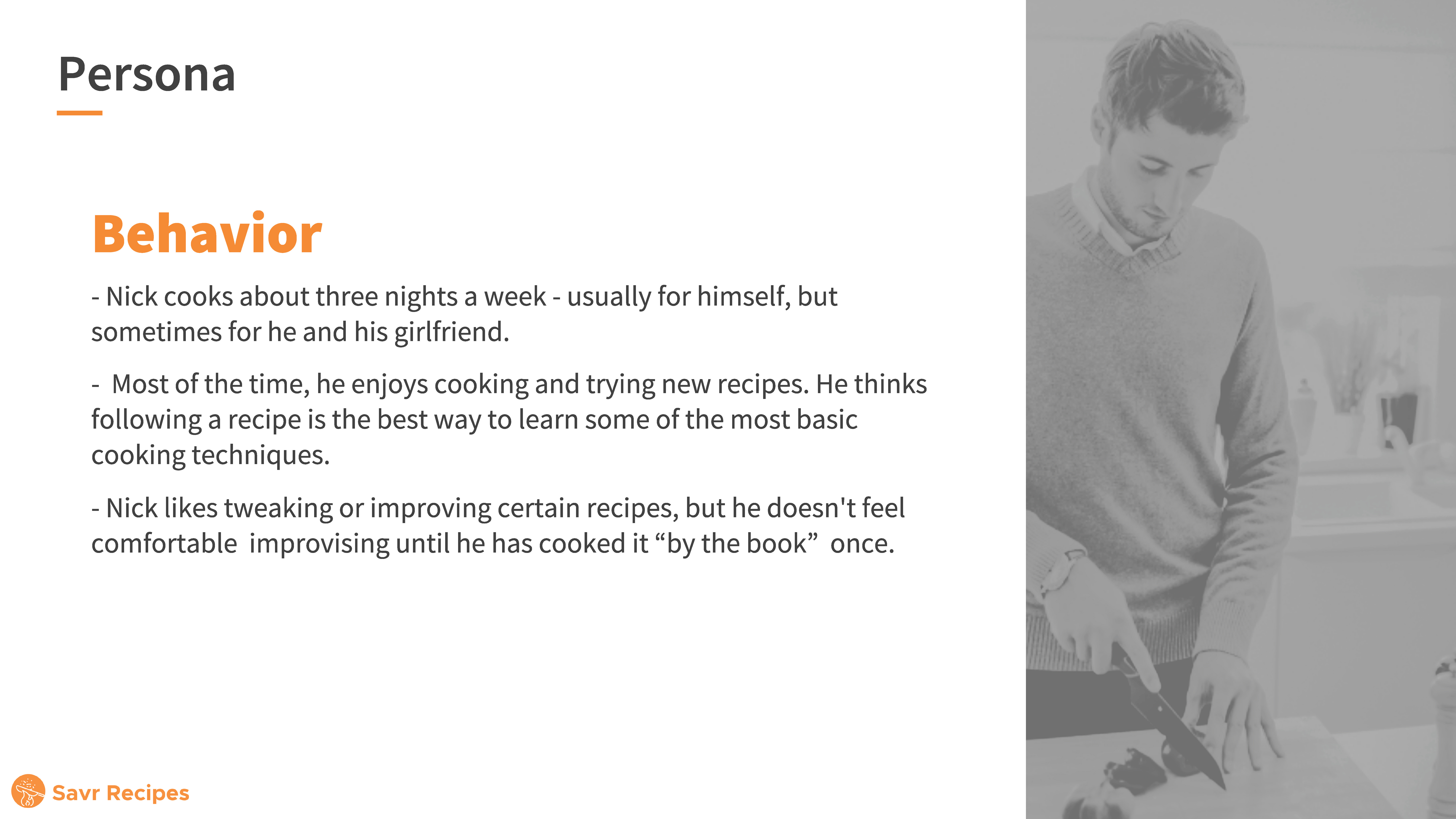
Nick’s main goal is to follow a recipe easily and confidently and for the dish to come out as expected. My main user cooks three to four times a week and is seeking new recipes to create. They hope that by following this recipe they will not only learn an easy recipe to reuse in the future but also gain valuable cooking knowledge.
For the first day of the Sprint, I took notes on the information I was given and categorized similar ideas and thoughts. From this beginning research, I was able to formulate a better understanding of the users and their troubles. Most users are frustrated with the process of cooking the recipe and feel the current app makes the process more stressful and can lead to mistakes in the cooking process. Some pain points for current users include:
- Full recipe information wasn’t given
- Techniques, cookware, how to cook with these ingredients
- Timing causes stress during cooking
- Parts of the recipe aren’t prepped until needed
- New steps are added during the recipe
- Unsure if the recipe is being cooked correctly
- Lack of imagery
- No knowledge of steps before cooking
“I like to be prepared as I possibly can before I start cooking things I can’t undo.”
Anna
Based on this information I developed three main issues to address with my app.
- How can we provide users all the needed information before the cooking process?
- How can we reduce confusion for users unsure about the recipe process?
- How can we reduce user stress while cooking?
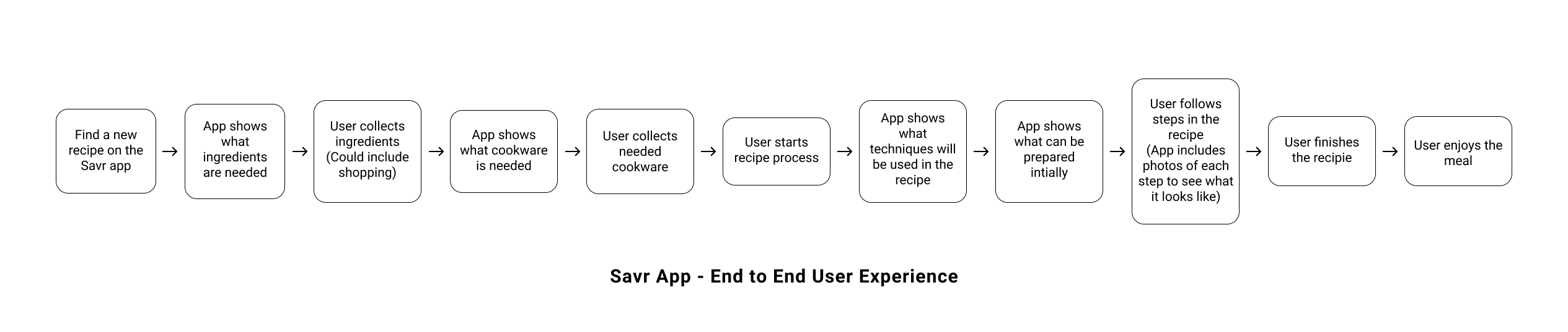
I felt that the answer to all of these issues was preparing the user before the cooking began. At the end of the first day, I also created a map of the end-to-end user experience. This was helpful to put myself in the user’s position and formulate the steps they would take when using this new feature.
Looking at competitor’s solutions in lightning demos
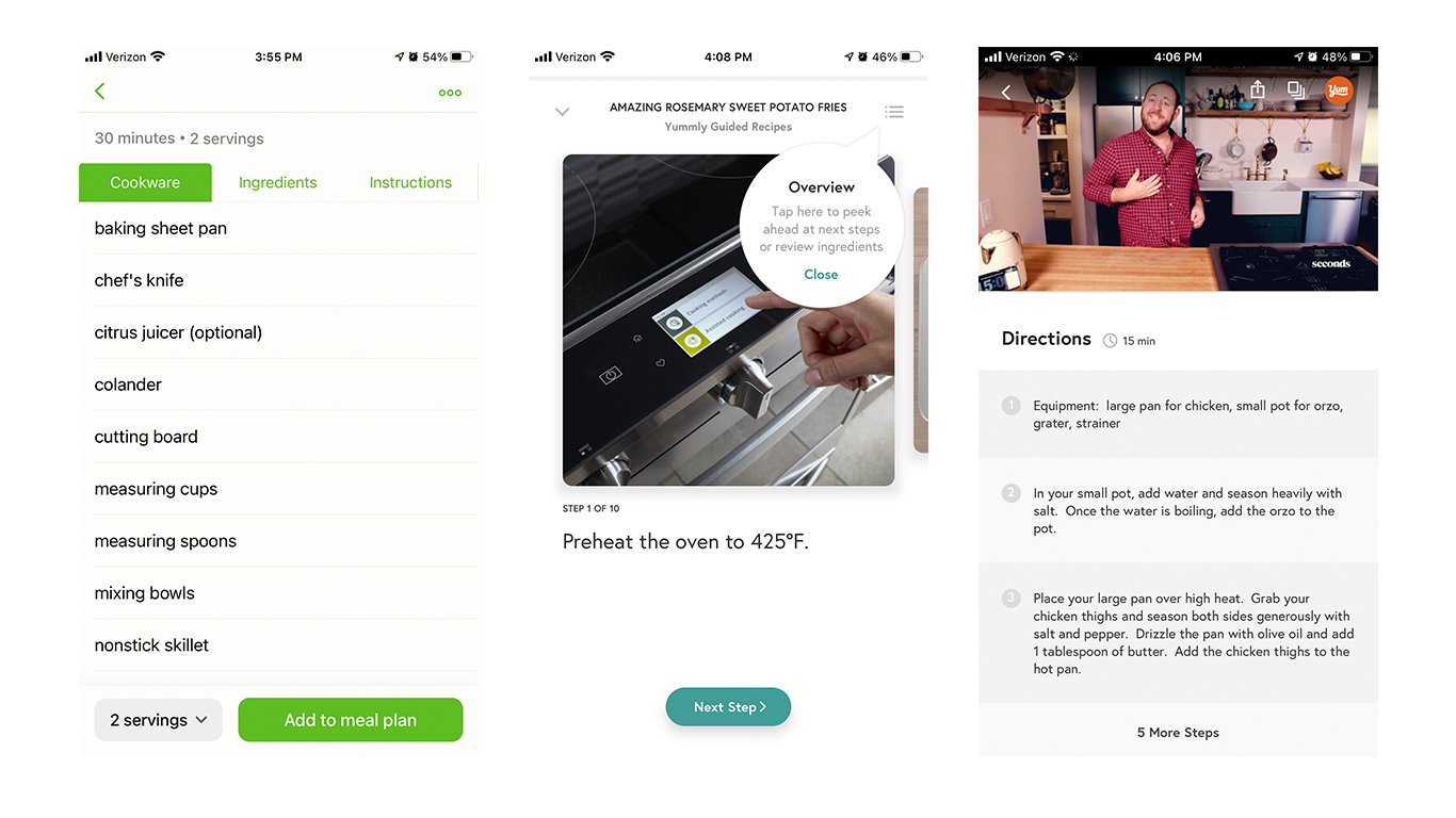
Before sketching on the second day I took time to look at other cooking apps to see their recipe process. I downloaded and demoed a few apps including Tasty, Mealime, Food Network, Yummly. I focused on the recipe page functionality and thought about how my users would interact with these.
Multiple of these apps had a step-by-step cooking process that walked users through each stage of the recipe. This process included photos or videos demonstrating the current step. The option was provided to see a full list of ingredients and steps at any point in the process. Mealime and Food Network’s page also had a list of needed cookware along with ingredients. Food Network also provided a list of techniques however this function was outside of the recipe section and had to be searched. Additional features that caught my eye were in-app timers and the ability to move your hand over the screen to move to the next step instead of touching the screen.
Building my solution from sketches
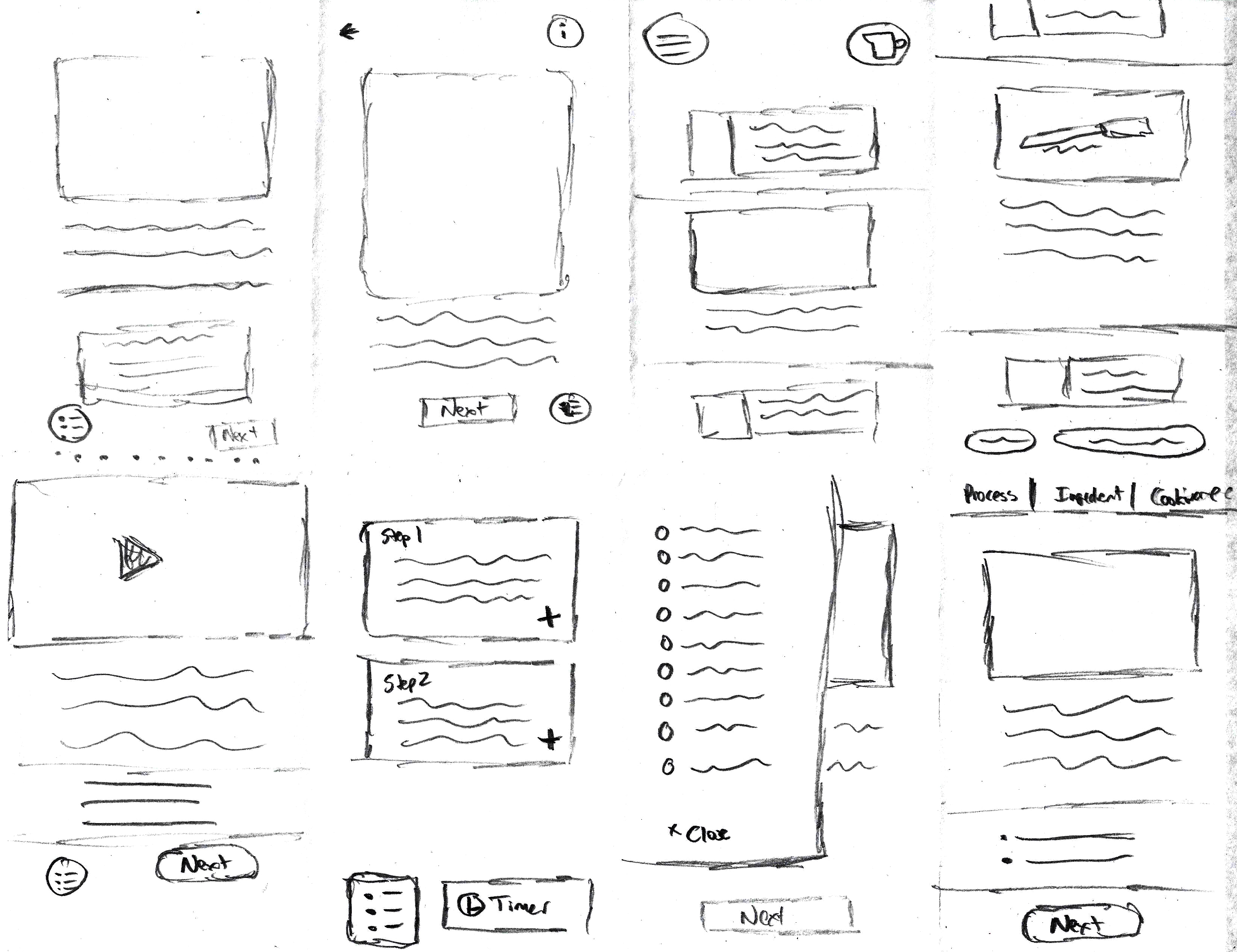
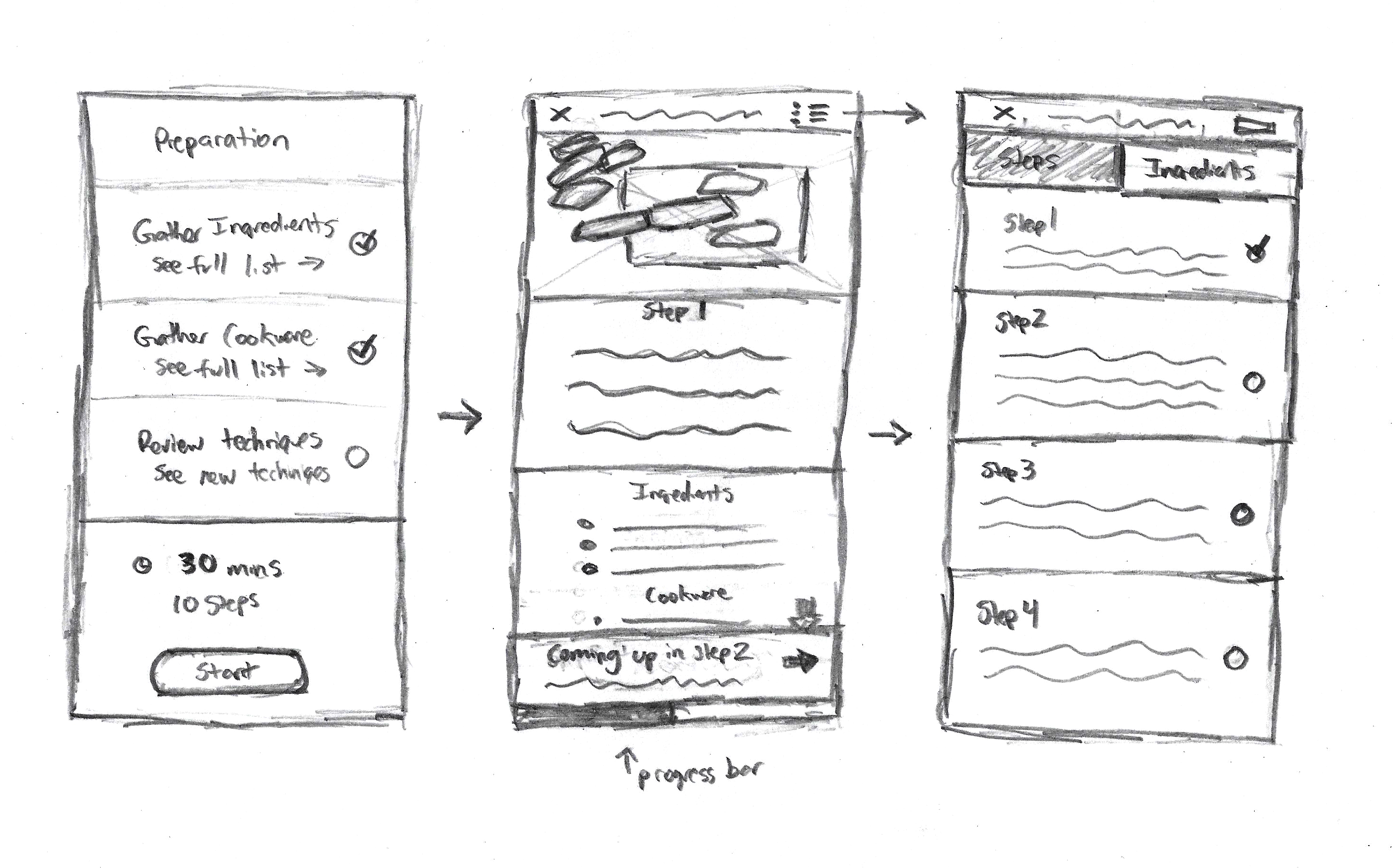
With the lightning demos fresh in my mind I created eight sketches in eight minutes. I was most inspired by Mealime and Yummly’s step-by-step process as I felt it let users focus on the current step while giving an overall impression of the entire recipe. I based my next iteration of the design on the final sketch in this sequence while pulling a few pieces from others. I wanted to make sure users would be able to see the full recipe sequence easily in order to know what was coming up next.
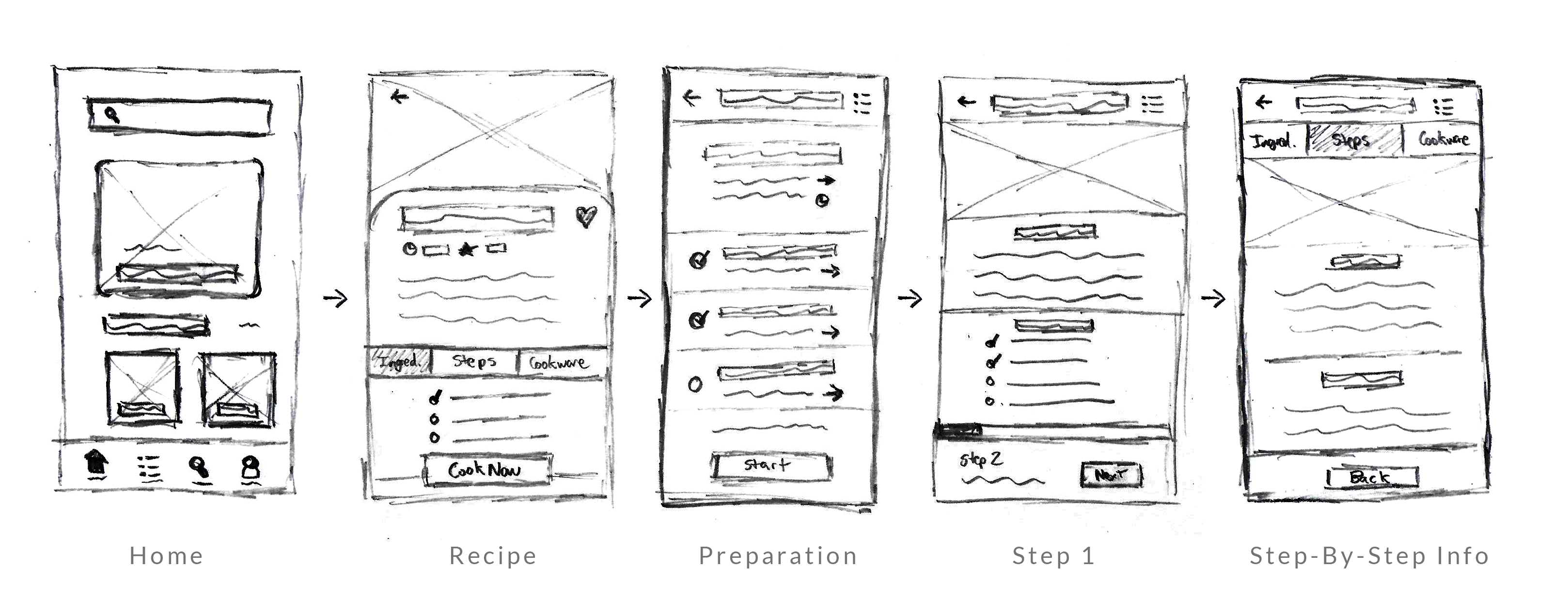
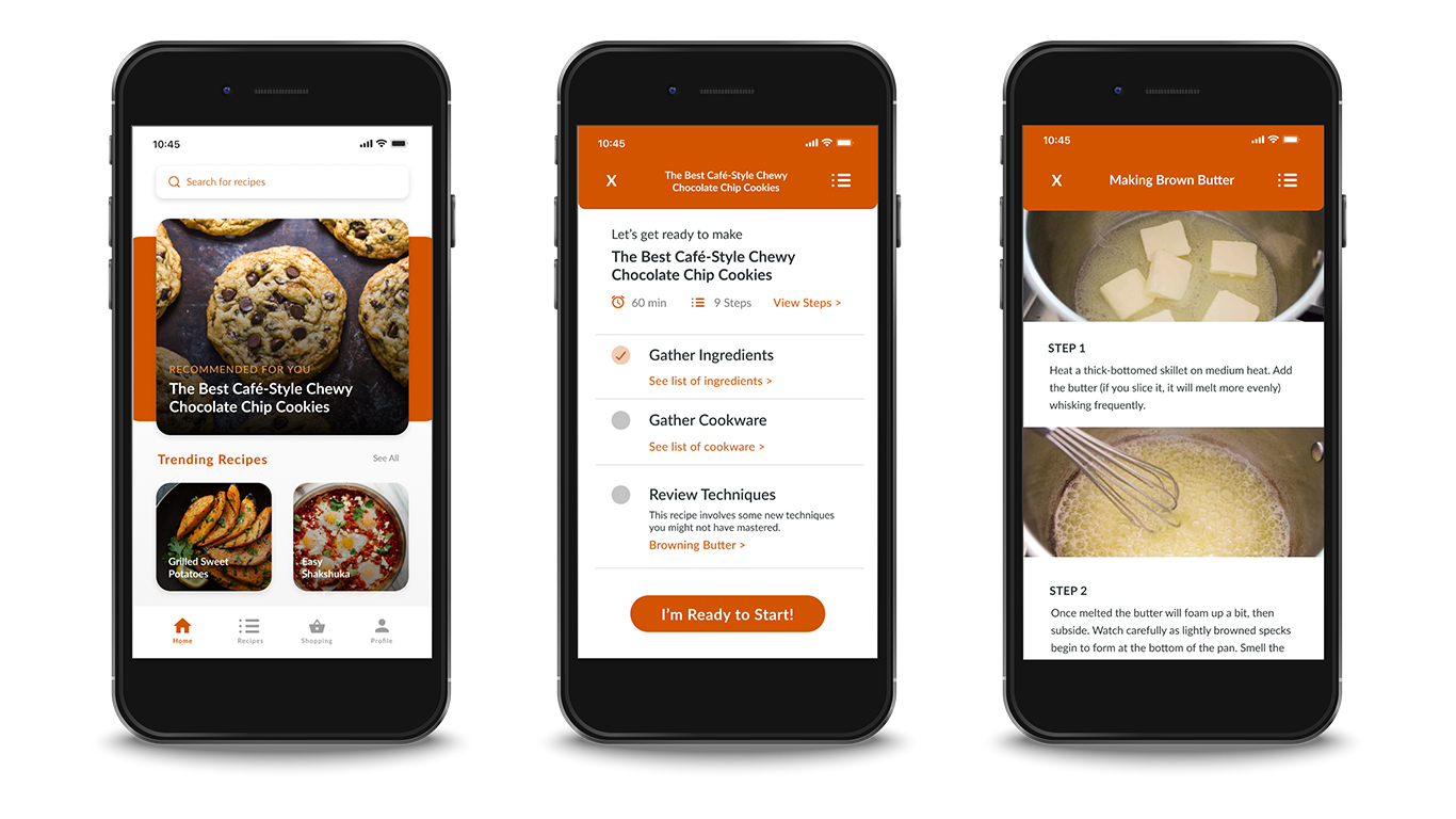
From there I developed a sequence of sketches showing how the step-by-step process would look. I also focused on the preparation page at the beginning of the process which would allow users to review all the information before cooking and provide a place to learn any new techniques before starting. It was important to include an option to see all of the steps, ingredients, and cookware listed out at any point during the process so users could always access that information.
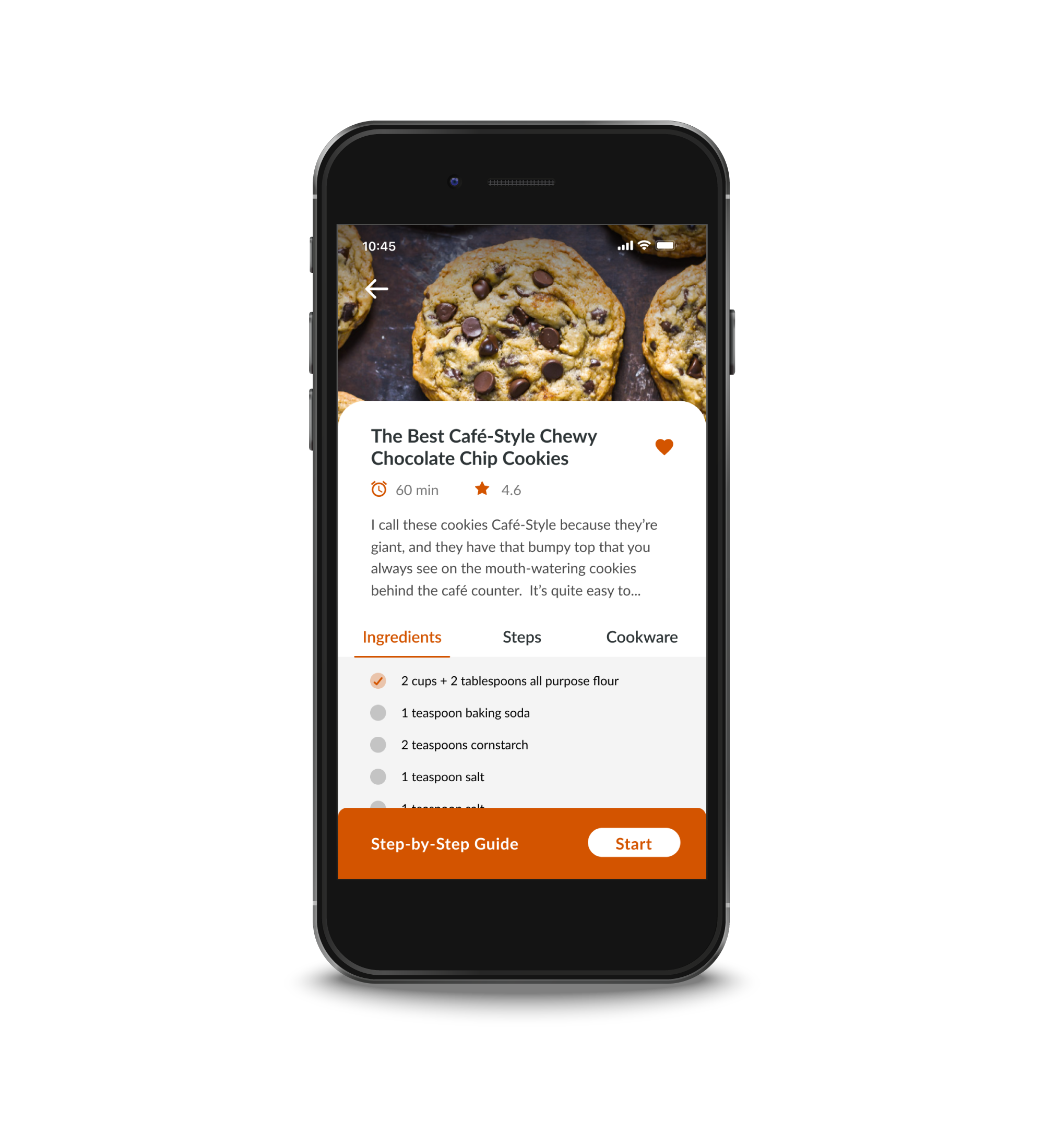
Most of the fourth day of the sprint was spent designing the prototype. Using my sketches as a base I designed the app in Figma. The designs needed to be realistic and completed in a short amount of time. I set up the main recipe page first using a UI kit for parts of the design to speed up my process. I included photos of recipes and processes because I knew that was important for users to see. Once the essential pages were designed I used InVision to create a clickable prototype to test with users the next day.
Testing my solution with potential users
On the final day of my sprint, I interviewed five users. All of my users cook at least three times a week if not more and were familiar with online recipes. A few had used apps in the past for recipes but most google recipes they are interested in. Two mentioned following specific users/cooks who they like. All of my users mentioned one specific annoyance with online recipes, reading long blogs before the recipe. A common wish for my users was recipes that are simple and quick though they didn’t mind a more complicated recipe if they could learn it and make it in the future easily.
Each user was pleased with the design of the app saying it looked like others they were familiar with. They were all happy with the layout of the recipe page and liked the ability to see the ingredients and steps immediately without having to scroll down. Multiple users expressed interest in the cookware list saying it wasn’t something they saw in other apps.
“I like the cookware feature. If I want to make a recipe when I get home, it’s nice to know if I need to grab something else from the store.”
Kara
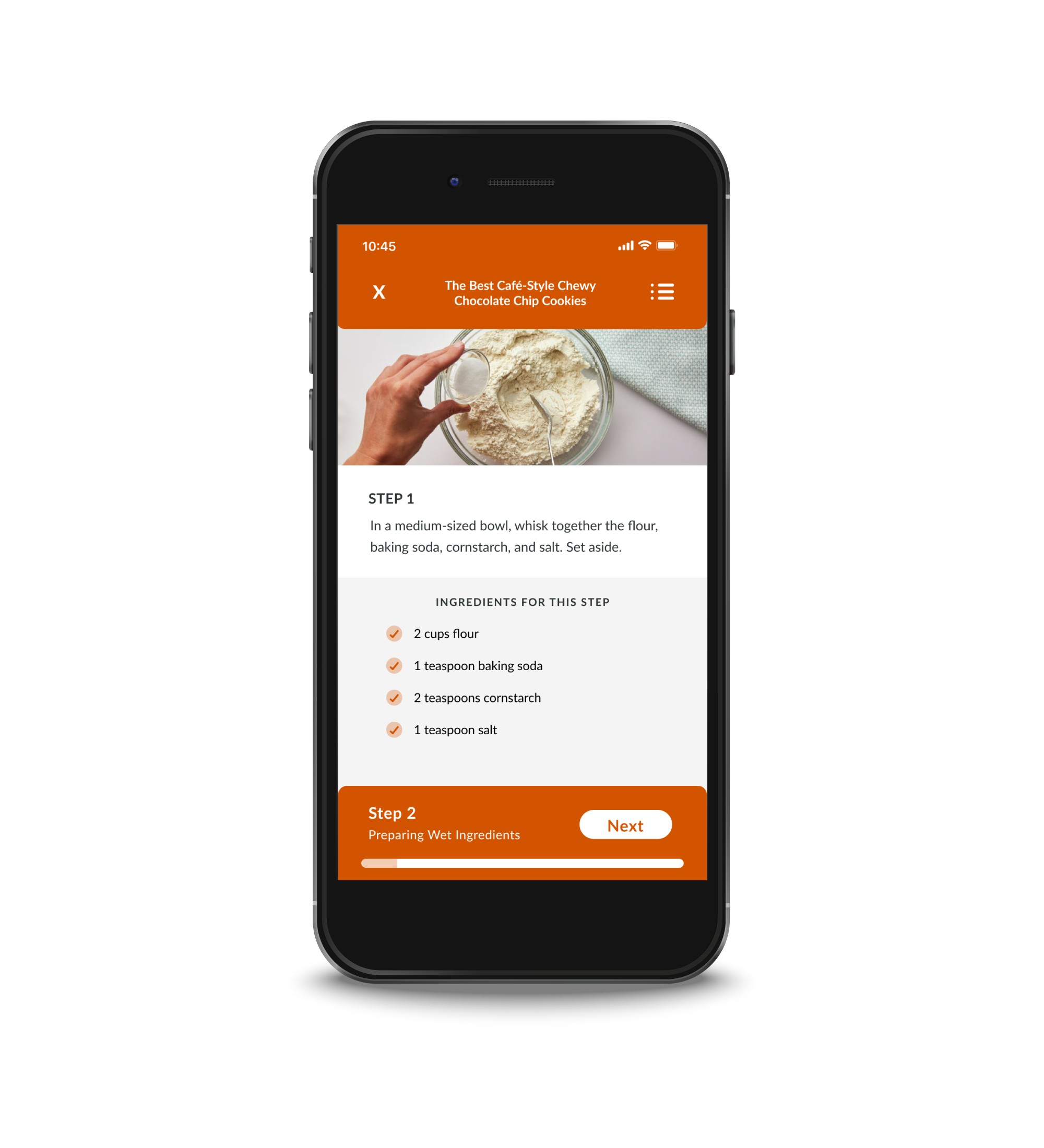
One of my main findings from the test was that users always liked the option to just read the steps of the recipe. The setup of the step-by-step process was good but it’s good to just scroll through to get an idea of what’s next. Users were open to the option of reviewing the next steps quickly in the step-by-step mode. Three of my interviewees said they would use likely use the ingredient check-off list as a way to keep track of where they were. The step-by-step process also helped to remind them of which step they were on. Having the ability to check off steps in the other mode would be a beneficial feature. Pictures were also a highlight for users citing their importance on both the recipe page and on each step.
“Cooking isn’t always a linear process so it’s beneficial to know all the steps before I start.”
Ian
Final insights from the Design Sprint and next steps
With the user tests completed all that was left was to debrief. Overall, while users felt that the step-by-step feature would be helpful in cooking they also said it wouldn’t be useful all the time. They anticipated that many recipes would be cooked just by scrolling through the steps. It was clear that no matter what the solution was, having easy access to the list of steps was important.
Another positive takeaway was the option to view techniques on the preparation page. One of my users said they would look up videos on YouTube to review techniques beforehand but it was hard to know if this was the correct way for the current recipe. By including the technique, she didn’t have that worry. Other users also praised the techniques page and liked the ability to scroll through quickly for a refresher. Based on this it could be important to add the techniques to the recipe page in case users didn’t use the step-by-step process.
Improving the step-by-step process could be a potential next step. An ability to review upcoming steps quickly was voiced by multiple users, this functionality was also available in a few of the demos I did. After these improvements, the app could be tested again with new users in order to gain more feedback. Since my main focus for the user test was testing if users felt prepared before cooking, it would be beneficial to do future tests in a real kitchen environment in order to gauge user stress levels while cooking.
- Eco-Stylist | UX/UI Design
- Sub-Track | UX/UI Design
- Savr Design Sprint | UX/UI Design
- Tabletop Detective | UX/UI Design
- PSU Admissions
- PSU Videography
- PSU CESLife
- PSU E-mail Design
- PSU Social Media
- PSU Photography
- PSU Advancement
- PSU Academic Programs
- PSU Alumni Relations
- Grand Hotels of the White Mountains
- PSU Athletics
- Tidbit Crackers
- Arts & Events at PSU
- Sidore Lecture Series
- The People's Forest
- Plymouth Magazine
- Academic Catalog